50 best retail initiatives of 2017
Sometimes when looking forward it’s good to take a peek over your shoulder as well. There’s a lot that can be learnt from what’s come before, whether it’s triumphs, mistakes, or hints of what might be the next big thing. With that in mind we’ve rounded-up our 50 favourite retail initiatives of 2017 to set you on the right track for the new year.
Which trends keep popping up? What will be important in 2018? What can you learn from these examples? From pop-ups to tech to store developments, these 50 initiatives should inspire you…
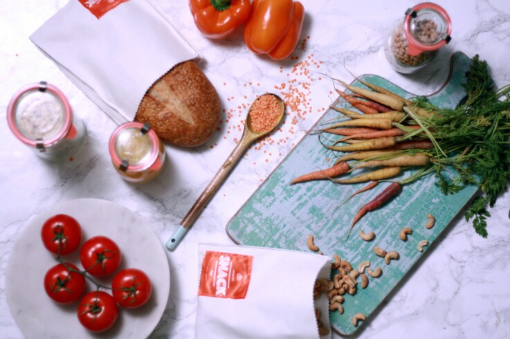
Image credit: Bulk Market
Pop-ups
1. Bulk Market
Based in Dalston, Bulk Market is London’s first plastic -free supermarket. More than 300 everyday items are sold in the space, predominantly dried goods. The products are stored in large jars and dispensers with customers either bringing in their own jars to fill with the amounts they need, or using compostable bags. The majority of the food comes from within 50 miles of the store so shoppers know exactly where it’s from and what goes into it.
The concept is an extreme, but great, example of tackling retail’s packaging waste problem – something all retailers should be thinking about. Having started life as a pop-up, Bulk Market has been so successful that is now moving to a permanent location and expanding its offering to include composting.
2. The Data Dollar Store
Cybersecurity firm Kaspersky Lab used retail pop-up The Data Dollar Store to demonstrate the value of their personal data to customers. The space, hosted in Old Street tube station in London, didn’t take any money, but instead asked customers to give away some personal information in order to buy items. This ranged from photos to text messages to emails in exchange for a mug, t-shirt or original print by artist Ben Eine. The information was then displayed on two full-size screens in the shop windows which meant anyone passing by could see it.
The space aimed to make customers rethink what information they give out and how valuable it really is, as well as why they need to protect that data more. It demonstrates how retail can be a platform for more than just selling products.
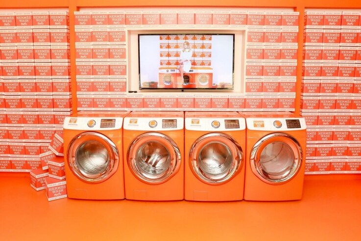
Image credit: Hermes
3. Hermesmatic
Luxury French firm Hermes took the brand on the road across the US with an innovative series of pop-up stores. The Hermesmatic was designed to look like a laundrette with a series of bright orange washing machines as the central focus. The space invited customers to bring in their old Hermes scarves to dip-dye them and breathe new life into them. Shoppers could also buy a vintage scarf to dip-dye or a one-of-a-kind design from a ready-made dip-dye collection. The scarves were ready in 24-48 hours.
The store travelled from NYC to Washington DC, Nashville and LA, focusing on places where Hermes didn’t have a presence already. It shows how a pop-up can help retailers reach new audiences and draw people in with the opportunity to have something unique.
4. Marie Claire: The Next Big Thing
As it says on the tin, this New York-based pop-up from Marie Claire Magazine was designed to help shoppers find the next big thing. Delivered in partnership with Mastercard, the pop-up was divided into three zones named after popular sections from the magazine – Work, Play, Peak, and featuring innovations in fashion, beauty, entertainment, technology and wellness.
It also featured some of the most interesting retail tech out there including smart mirrors from Oak Lab, Sensor Mirror Pro’s by Clarins, smart windows and Mastercard’s Masterpass digital payment which enabled customers to make cashless transactions from anywhere in store. More than anything, it’s the tech that might just have shown what is the next big thing for retail.
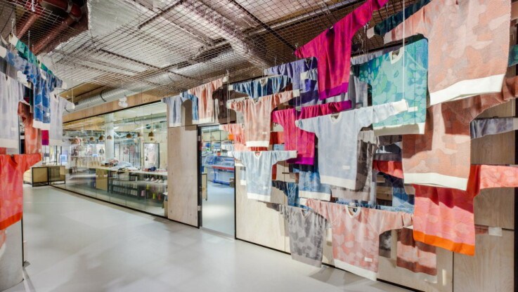
Image credit: Adidas Knit for You
5. Adidas Knit for You
Adidas’ Berlin-based Knit for You concept was one of the most interesting pop-ups to launch last year and a window on what might be the future of shopping. The space allowed customers to design a bespoke sweater, which was then knitted in real-time by the in-store knitting machines. Completed sweaters were ready within four hours. The pop-up used interactive software to let customers pick the design they wanted, with the ability to tweak it after, and then carried out a full body-scan to ensure a perfect fit. The concept evolves the current retail model from ‘see it, buy it’ to ‘think it, test it, make it, buy it’ – something we may see more of in stores this year.
6. Color Factory
Over in San Francisco, Color Factory is actually a 12,000 sqft experiential art installation focused on colour, rather than a retail space. Created by Oh Happy Day party store and designer Erin Jang, the two-storey site is home to 15 unique art installations. Each installation is housed in its own room and has a party theme, such as a yellow ball pool and blue balloon bath.
Where it gets interesting for retail is that each visitor is given a connected Color Factory card which links to their email address and the cameras in each room. Visitors swipe the card to signal to the cameras they are ready to take a photo. The photos are then collected and sent straight to their inbox. How might retail employ the same fun-for-customer info value exchange in-store?
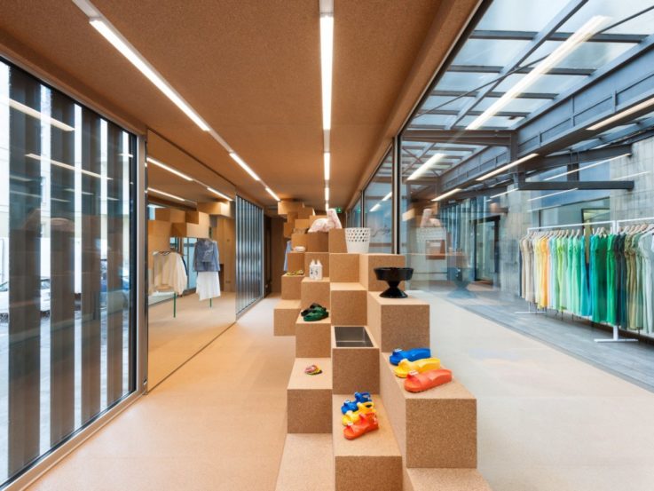
Image credit: Birkenstock
7. Birkenstock Box
Germany-based footwear brand Birkenstock launched a new retail concept this year called ‘The Box’. Architects Pierre Jorge Gonzalez and Judith Haase transformed an old freight car into a mobile store space that has travelled the world to selected partner retail stores, including Berlin and New York. At each space the host store gets to decide on the interior design and merchandise on offer, encouraging creative communication between artists, retailers and customers. As a brand-building exercise it’s interesting enough, but it also shows just how much retail can push outside the box.
8. Olympus Perspective Playground
With the Olympus Perspective Playground series of pop-ups, camera company Olympus enabled customers to sell its products to themselves. The on-going pop-up project, which travels around the world, is at its heart an art and photography installation. However visitors are also able to borrow Olympus’ OM-D, PEN cameras and ZUIKO lenses free of charge to use during their visit. They are then allowed to take the storage card of photos home with them. By letting customers experience the products in a pressure-free way, Olympus sells them the idea of owning its cameras.
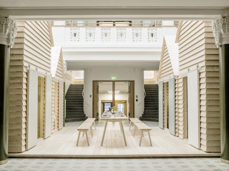
Image credit: Koti
9. KOTI
Created to celebrate Finland’s 100 years of independence, this pop-up actually took place in Paris. Named KOTI (which means home in Finnish), the pop-up turned the Finnish Institute of Culture in Paris into a hotel and living pop-up installation, which was available for booking for 100 days on Airbnb. The space was designed by Linda Bergroth, kitted out in products by Nordic designers, and guests were treated to a traditional breakfast every morning. When it comes to selling a concept, even if it’s of a whole country, experience is the best way to do it.
10. Nike Airmax 4th Anniversary
To celebrate its fourth annual Air Max Day, Nike opened a series of Sneakeasy Pop-up shops across Chicago, Los Angeles, Toronto and New York. These weren’t your standard spaces though. To gain entry to these hidden shops, fans had to sign-up on a microsite (one per city) and track the corresponding Twitter accounts for details of the locations. Once a Sneakeasy store was found, customers were treated to local art installations inspired by “air”, occasional music performances and a personal fitting service. The idea is a great example of how to use exclusivity and the idea of being in the know to draw customers to your brand, and keep them interested – even if you’ve been going as long as Nike.
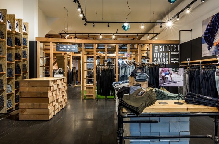
Image credit: Dish & DUER
Physical retail
11. Dish & DUER
There’s two reasons Dish & DUER’s space makes the list – one is that the company responded to the desires of its customers to test its jeans and created a Performance Denim Playground in the store. Equipped with a treehouse, rooftop hammock, monkey bars, a swing set and more, the space encourages customers to hang out, as well as see how well the product will live up to an active lifestyle before purchasing. It starts to put the idea of owning the jeans into their head.
The other reason is that in the same space Dish & DUER has pulled down the walls to allow customers to see directly into its design studio. It makes the company feel more accessible, as well as giving customers a chance to talk directly about what they want to see from future products.
12. Tiffany Café
Worth a mention purely because it’s one of those perfect brand opportunities that you’re amazed hasn’t been done sooner. The idea of Breakfast at Tiffany’s has been famous since 1961, now it’s a reality. This year the iconic New York jewellery store opened up an in-store café. Called the Blue Box Café, visitors can have breakfast, lunch or high tea in luxurious surroundings. It serves as a way for Tiffany to tap into new audiences, particularly tourists, in a way that is completely in keeping with the brand identity.
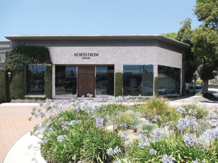
Image credit: Nordstrom
13. Nordstrom Local
Luxury department store chain Nordstrom branched out last year with the launch of Nordstrom Local – small format stores without any inventory. Instead of inviting customers to browse rails, the spaces have a number of dressing rooms and a ‘styling suite’ for personal stylists to transfer in merchandise for customers and curate outfits specifically for them.
The stores also act as a place for customers to pick up online orders, get items altered, and even have a drink or treatment while they shop. Same day delivery is available for shoppers who visit Nordstrom Local and select items before 2 p.m. It’s a great example of how retailers are starting to redefine what we deem ‘retail’.
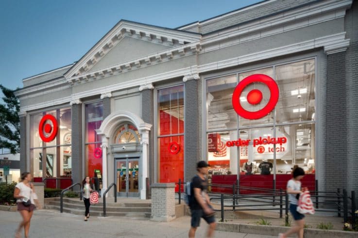
Image credit: Target
14. Target small-format
Another big name trying a new concept last year was discount store retailer Target. The company opened 11 small-format US stores to serve urban and suburban areas, where customers can be far from a full-sized Target.
With less space for inventory, each stores product range is tailored to the location and the needs and interests of local consumers. Target enhances this local feel with art and architecture design feels natural to the area, such as the Brooklyn store which resembles the movie theatre that was previously there. It shows how brick-and-mortar strategies are evolving in response to lifestyle trends.
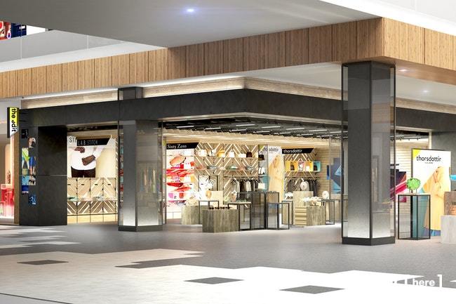
Image credit: Roosevelt Field
15. The Edit @ Roosevelt Field
One big talking point has been the evolution of the shopping mall. Long Island mall Roosevelt Field might have the answer with its new concept – The Edit @ Roosevelt Field. The initiative taps into the pop-up trend with a dedicated portion of the mall given over to retail spaces of 20 to 200 square feet.
Retailers early on in their business can set up shop, typically on a quarterly basis, to try out new retail initiatives, pilot new products and more. The Edit is a way for the mall to keep offering customers something new, as well as to test out which retailers and concepts shoppers respond to best.
16. Tom Ford
Another first in 2017 was Tom Ford’s standalone beauty retail store in London. The space is divided into separate rooms for different types of experience. This includes a ‘colour room’ where visitors can virtually try on every shade from the lip colour collection through augmented reality – no muss, no fuss. There’s also a make-up room with makeovers and demonstrations, plus the ability to record your own how-to-video tutorial to use at home, a grooming room for men, and a fragrance room which use interactive tech to let visitors digitally explore the perfumes.
The use of different rooms evokes a feeling of exploration and discovery – much like an art installation, but it’s also not overwhelming or difficult to shop. With the wealth of options supposedly making organic discovery more difficult, Tom Ford’s physical store doesn’t just help new customers discover the brand, but continue that journey when inside.
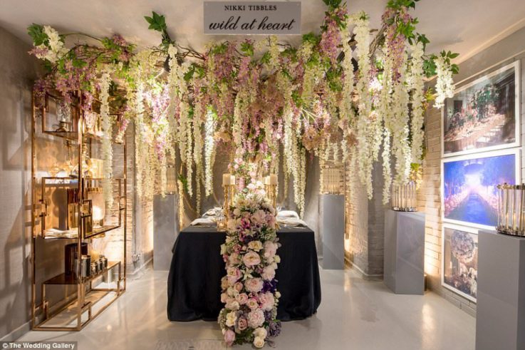
Image credit: The Wedding Gallery
17. The Wedding Gallery
The Wedding Gallery is a permanent all-wedding retail, planning and inspiration destination in London. Designed to offer couples a one-stop place to book everything they need for their big day, the space is located within one of London’s most lauded wedding and events venues, One Marylebone.
Curated by leading industry experts, The Wedding Gallery is almost like a department store for weddings showcasing vendors from venues, cake makers, stationers to florists, caterers, photographers and more. There’s even an in-store hair and beauty salon. If they want more help customers can book a 90-minute appointment with an in-store consultant who will guide them round the space and planning process.
It shows that there are still opportunities and gaps in the market for retail to fill.
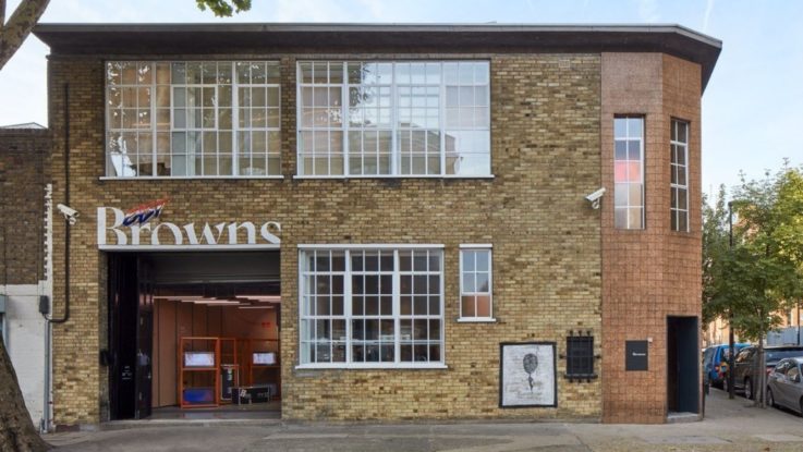
Image credit: Browns East
18. Browns East
For its first new brick-and-mortar store in 20 years, London’s luxury department store Browns opted to do something a bit different. Browns East is backed by the Store of the Future tech of e-tailer Farfetch to provide an enhanced experience through augmented reality. Shoppers can view purchases in different settings, see recommendations and link their online wish list with the store. An “infinite shelf” feature means every store associate has access to the full Browns product offering
Experience is the big focus, from the rotating café to the branded entrance installation for local creative to takeover. The space also serves as the launch point for Browns Nomad project, a semi-permanent, roving retail concept. It shows that even a heritage brand can be forward thinking if they want.
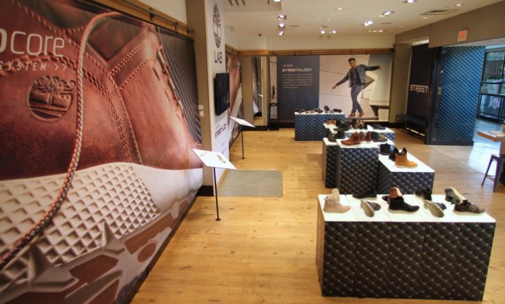
Image credit: Timberland
19. Timberland Tree Lab
The Timberland Tree Lab is a US-based speciality concept store from the global outdoor lifestyle brand. The space is designed to completely change every six weeks, with different design themes, curated product collections and brand stories.
While in the store customers can try a local craft beer or bottle of water. The bottles are then recycled into Timberland linings or shoelaces, which serves as a great way to demonstrate the eco-friendly efforts of the company.
The space isn’t just about Timberland though. The store associates are there to help customers with their purchases, but also anything else such as what local events are coming up. The Tree Lab is one of the best new ‘experience’ led retail executions as a store that you want to spend time in and revisit.
20. Saks deconstructed department store
Saks’ Fifth Avenue store is one of the world’s most iconic department stores. But its newest concept is to turn that traditional large-store, multiple department model into something different. The company is opening three new stores in Connecticut all focusing on a different product offering – women’s shoes, women’s fashion and jewellery.
The idea is to position each space, which would normally be within the same Saks store, as a specialist in its field. Each store will retain a department store ‘feel’ with a range of different brands and shops-in-shops on offer. It’s a different idea, but one that could prove more tenable for growing a department store brand in other locations – without the need to invest in a huge footprint.
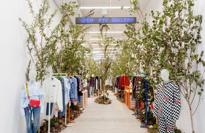
Image credit: Off-White
21. Off-White at Em Pty Gallery
For its new US store fashion brand Off-White opted to move the focus away from itself. The store doesn’t bear the Off-White name, but is instead known as Em Pty Gallery. In keeping with the name, the space is more of a gallery where nothing is permanent.
The design is led by different artist collaborations, who have creative freedom over the space. Off-White then matches that vibe with a curated collection of clothing. Customers don’t have to buy, but can just enjoy the space for the art and even taken away a gallery brochure, or leave a comment for the designer. It makes culture and art the focus, with Off-White as the curator. As such, the brand starts to mean more to customers than just someone who sells stuff.
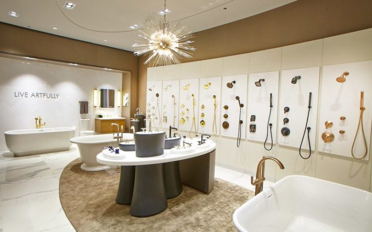
Image credit: KOHLER
22. KOHLER
Would you try-before-you-buy a shower in a store? You can do just that in the huge new New York hub from kitchen and bathroom manufacturer KOHLER. As well as the private showering space for those that fancy it, the store also features a number of other tubs, sinks and toilets which are fully functional. The company believes that being able to turn on the taps and test them can be very persuasive to customers.
The store doesn’t just benefit shoppers though, but is the debut location for KOHLER’s global specification service that lets professional architects and designers working on international projects access the entirety of the brand’s products worldwide. It shows that almost any type of retail can incorporate experience in-store if desired.
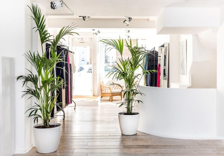
Image credit: Galvan
23. Galvan
The Studio is an new concept from designer dress brand Galvan, which goes beyond the typical retail space to incorporate an office, workspace, showroom, archive and bridal atelier. The company has spent time getting to know the habits of its London customers and created a number of services with these in mind.
These include the ability to purchase the current collection, pre-order from the next collection and place orders from the Galvan archive, and home delivery of online purchases by a sales assistant who can do a complimentary in-home fitting and take garments away for alteration. It’s all about getting closer to the customer and offering them a service so perfect they don’t need to go anywhere else.
24. Today at Apple
With Apple now insisting that its stores are actually ‘town squares’ the importance of experience, rather than straight selling, is clearly not lost on the brand. Last year, it took it a step further with the launch of the Today at Apple concept – a programme of free events taking place at each of its stores.
What’s on offer varies from location to location, but includes everything from concerts to music-making, art and photography classes. The idea is to encourage customers to come in and learn more about what they can do with their Apple products, or to let them experience them before they buy. As such, the store becomes about a place to interact with the brand and build a relationship, not to buy.
Apple certainly aren’t the first or the last to explore this type of thinking, but when a brand as big as them gets on-board with a concept you know it’s likely to pay off.
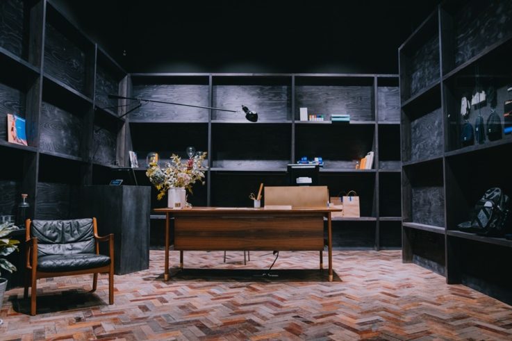
Image credit: Adidas
25. Adidas
Adidas has gone local with its Shoreditch flagship to show how big brands can also appeal to local communities. The focus of the store is to “provide a destination for local creatives to meet, network and bring their ideas to life”, rather than buy. It’s about Adidas facilitating contact and drawing in the sort of cool influencers that others want to follow.
The products that are on offer are specially selected from product drops to limited edition and seasonal items. There’s also a permanent activation wall, which offers pieces from London-based creative. The space proves that brand communities are very much part of retail’s future strategy still.
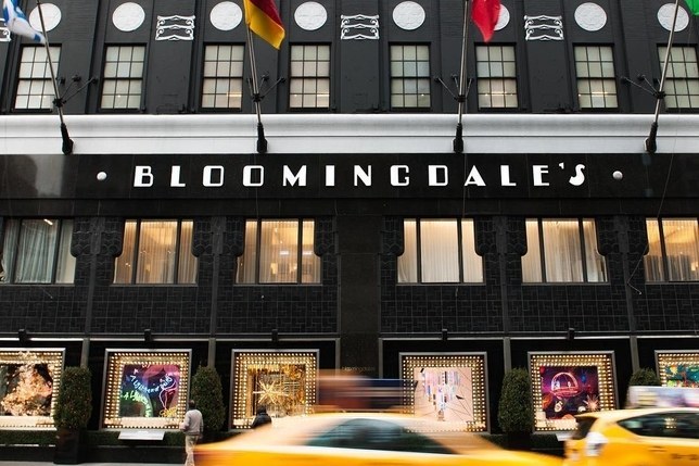
Image credit: Bloomingdales
26. Glowhaus
Glowhaus represents a radical new approach to beauty from US department store Bloomingdales. Thirty brands were selected for the Glowhaus concept, offering a total of 800 products all priced at under $100. To select the brands Bloomingdales turned to its younger staff, which means they’re the sort of hot brands you’re more likely to see on Instagram than in a department store.
This helps to attract a younger customer base into the store, with the hope that they then become regular Bloomingdales customers. Glowhaus features space for customers to try before they buy and take selfies to share with friends. Brand agnostic associates are on-hand to help customers pick the best products for them.
Glowhaus is a great example of how department stores can update their offering for a new generation who may not have a huge amount of money to spend right now, but might in the near future.
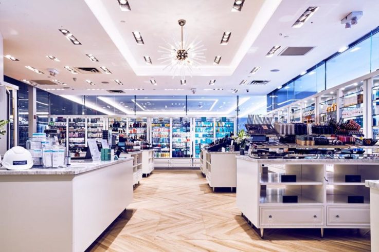
Image credit: Bluemercury
27. Bluemercury
Another new development in cosmetics retail came from Bluemercury whose New York space serves as a dedicated technology innovation hub. The brand will use the space to trial its natural ingredient products and launch new proprietary products.
The store also has an Artificial Intelligence Mirror that lets customers take any product, scan it and get all of the info on it, including reviews and videos. It will also be used to test new checkout and delivery concepts – not least Bluemercury’s rival to Amazon Prime Now. This same-day, under-one-hour delivery service could enable Bluemercury delivery drivers to meet customers on their way to events. As such, Bluemercury may start to change the way people shop for beauty.
28. Square
Mobile payment provider Square Inc. opened its first physical store in New York this year, in a move that builds its brand with both retailers and shoppers. The majority of the space is given over to curated merchandise from sellers that use Square. This enables the product range to be changed as frequently as Square likes. It also means that curious shoppers become used to seeing the Square name, which builds trust.
Equally, the store sells Square’s point-of-sale hardware for retailers and has a support desk to help them with any issues. Again, it helps to sell Square’s offering to more retailers by giving them a physical place where they can look at and talk about its solutions. The move shows that retail space can by much more than just traditional retail brands.
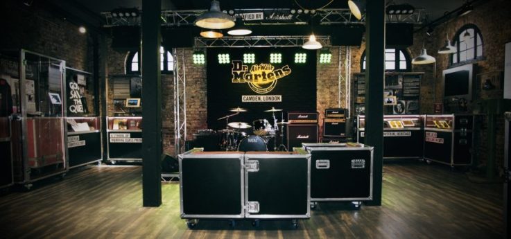
Image credit: Dr Martens
29. Dr Martens
Dr Martens has always been closely linked with London’s Camden market, which made it the perfect location for the brand’s new store. As well as wide range of Dr Marten boots, the store also features virtual tours of the brand factory, a GIF booth and a customisation area so that customers can personalise their DM’s. The biggest draw though is the DM Boot Room, which is an in-store gig space and bar created in association with Marshall Amps. It’s perfectly in keeping with the brand, and shows the importance of creating experiences that fit with your image and customer base.
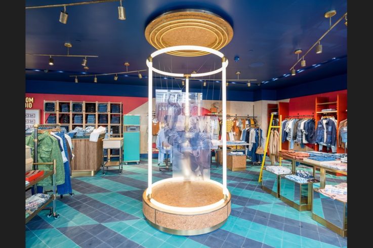
Image credit: Pepe Jeans
30. Pepe Jeans
Pepe Jeans’ new London flagship is one of the best new tech-enabled stores. Every item in the store has RFID technology in its tag, which interacts with the various tech in the store. This includes the smart changing room, which detects products that are brought in and enables customers to pick different colours or sizes etc on the interactive screens.
The store also boasts other interactive digital screens around the store, as well as a Twitter wall which features messages sent to the store account. Outside of digital, the store also has a customisation station where customers can personalise their denim with text, studs and more. It’s a great, practical example of in-store tech in action.
31. Toyota Drive to Go
Tokyo-based Drive to Go is a new car share concept from Toyota aimed at a younger generation who may not want, need or be able to own their own car. A combination café and showroom, Drive to Go is aimed to make renting a car as easy and quick as buying a cup of coffee. Those who don’t need to rent a car can still use the space as a place to relax, grab a coffee and recharge. The design is very different to your average car showroom, with a focus on softer materials like wood. Drive to Go is a great example of a brand that knows what customers want and how retail can be tweaked to keep bringing value to their lives.
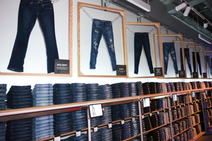
Image credit: AE Studio
32. AE Studio
American Eagle Outfitters’ new New York store is a perfect example of retail tailored to the local environment. With the store located in an area rife with college students, the whole space has been kitted in a way designed to make it a hangout for them. An upstairs lounge has plenty of seating and charging facilities, but also three washers and dryers so students can do their laundry.
The fittings rooms are also tech-enabled, but in a much more cost-effective way than most of the smart mirrors seen to date. An iPad in each room lets customers summon sales associates and/or enter in which items they’d like to try. Mobile point-of-sale devices mean store assistants can take payment in the fitting rooms or anywhere on the shop floor. It’s the kind of tech execution that is available to most retailers showing that these sorts of enhancements aren’t only for huge budgets.
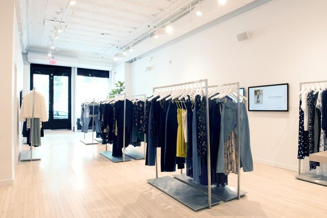
Image credit: Reformation
33. Reformation
The new New York space from Reformation is an extension of the tech-enabled concept it’s trialled in San Francisco, Los Angeles and Dallas. The store is run like a showroom so every item that’s on display is just a sample. Customers actually shop via the large touchscreens on the walls, which shows only what the store has in stock. Anything they want to try can be added to a digital dressing room list. Or if they browse the rails and find something they like, the sales associate can scan the tag to add it to the list.
The in-store team then pull the selected items from the stockroom and put them in a two-way wardrobe for the customer to try. An in-dressing room touchscreen means customers can request other styles or sizes as needed. If they want to buy they can check-out anywhere in the store via the mobile point-of-sale devices each assistant carries. It’s a fab blend of digital and physical that offers a seamless experience.
34. Mac and Bumble & Bumble
Mac and Bumble & Bumble’s new dual-brand space in Dallas is a great example of how owners of multiple brands can combine them to create more powerful experiences. The two Estee Lauder owned businesses have joined forces to create a hair and make-up retail space. Shoppers can tap into Mac’s make-up expertise with makeovers and masterclasses, or Bumble & Bumble’s hair styling prowess with wet or dry services. Or both for a total express makeover.
There’s also space for retailing both brand’s products for shoppers who just want to buy, but not book a service. It makes for a much more valuable proposition than an individual store by each brand, and may help each to introduce themselves to new audiences.
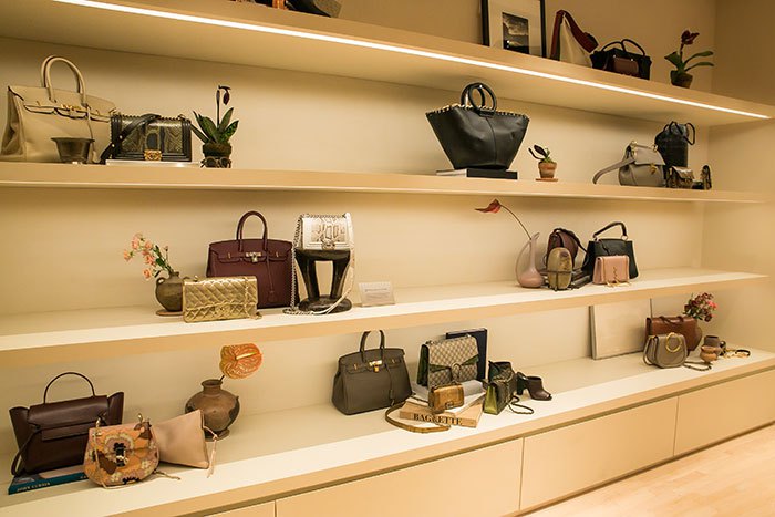
Image credit: The RealReal
35. The RealReal
With its first ever retail store, luxury consignment company The RealReal gave everyone a look at what the future of luxury retail might be. For a start, the 6,000 sq ft, New York showroom is full of one-of-a-kind luxury items from shoes and accessories to fashion and jewellery. This range is refreshed daily so there’s always something new.
An on-site Luxury Consignment Office lets customers have their jewellery and accessories valued free of charge or dropped off for consignment. They can also access professional repair, alteration and authentication services, and then relax in the in-store lounge area or café.
Most interesting though is that visitors have access to The RealReal’s specialists across every category for further information, questions about authentication and valuation, and even details on production. The team also host free workshops twice a day to help impart their expertise to the company’s shoppers. Exclusive, unique products and expertise is a big part of the future of luxury retail and The RealReal shows how it can be put into action.
36. Target two-door store
One of the most interesting new physical retail openings came in the form of Target’s two-door store in the Houston area. The store has long hosted different types of shoppers – those who like to browse and those who know exactly what they want – but this is the first store that splits those experiences.
The space has two entrances – one is for customers seeking ‘ease’ and one for those seeking ‘inspiration’. The ease side of the store is laid out like a supermarket-style with groceries, wine, gifts and such. Customers can also pick up online orders in a variety of ways. In contrast, the inspiration side has a higher-end department store feel with space for customers to wander and browse fashion, homeware and more.
While dividing customers is quite an extreme approach, the store shows that Target is conscious that people shop in different ways for different things and exploring how retail can provide that.
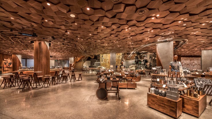
Image credit: Starbucks
Tech
37. Starbucks Shanghai Roastery
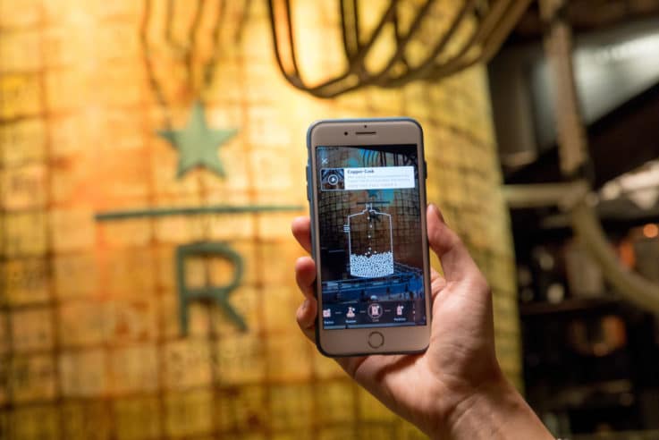
Starbucks opened a new type of experiential cafe in China last year in partnership with retail giant Alibaba. The Shanghai Roastery is a huge, two-storey retail space, which uses tech to enhance the fantastically designed space. Using Alibaba’s Taobao app, customers can access a digital menu, order and pay from their phone. There’s also an interactive map designed to encourage customers to explore the space.
The focus is on watching the baristas creating the drinks and the myriad of techniques and tools involved. Customers can get more involved in this by using their smartphone and AR to see inside the brewing process and learn how it’s done. The experience is very different to most other cafes out there, which means when making a choice on where to go it could be the thing that makes customers lean towards Starbucks.
38. Bottletop 3D printed store design
A different type of tech is being employed by Bottletop, the luxury designer using upcycled materials, for its first flagship store. The whole store interior design is being 3D printed, segment by segment, over a series of months. As such, each time a customer visits it will look a little different as it approaches completion.
The interior design material is made entirely from plastic waste, which ties into Bottletop’s ethical stance and brand ethos perfectly. Above hangs thousands of metal cans embedded in a 3D printed lattice, while below the floor id made from recycled car tyres. The store even has its own Kuka 3D printing robot in the store window, which not only helps draw people in, but can also live-produce bag charms and keyrings for customers.
As a look at what 3D printing could do, Bottletop is a great example of how it could change retail design and merchandising, as well as the products on offer.
39. Amazon Key
Worth mentioning because it could be a real game changer – if customers will get on-board with the tech. Amazon Key will allow Amazon couriers to drop off packages inside the customer’s home using a smart lock and camera combo. It’s actually Amazon’s response to Walmart’s partnership with smart lock maker August, which does much the same thing but with grocery deliveries.
With Amazon Key when a courier arrives with a package and scans the barcode, which then gets sent to the Amazon cloud for approval. If all is ok then the front door smart camera will start filming, and the courier will be able to enter with a swipe of their smartphone app. The customer gets a notification to say the delivery has been made and a copy of the video of the drop-off.
At present most consumers are probably uncomfortable with the idea of giving strangers access to their home, but Amazon is banking on being at the forefront of the movement should it happen. It also raises questions about what other opportunities exist around retail and our homes.
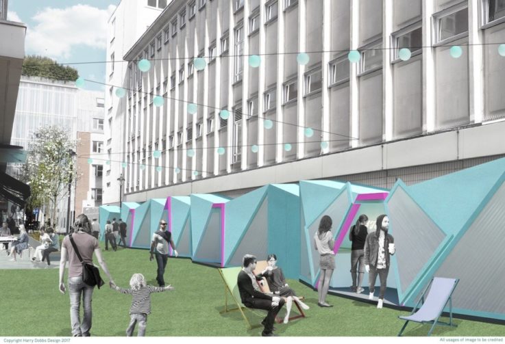
Image credit: Bird Street
40. Bird Street Smart Street
London saw the debut of the world’s first sustainable ‘smart street’ last year in the form of Bird Street. This traffic-free oasis combines next-generation technology from around the globe for a sustainable, innovative shopping experience.
The retail element comes courtesy of pop-ups, curated by pop-up space professionals Appear Here, to ensure there’s always something new for shoppers to explore. These pop-ups make use of mobile payment apps and digital selfie mirrors to offer a slicker experience to customers.
The street itself uses Pavegen technology to generate electricity from visitor’s footsteps. In addition, a bespoke bench from CleanAir gives visitors a chance to grab a bit of fresh, filtered air as a break from the normal polluted city atmosphere.
As a look at what the future of our streets might be, Bird Street is an interesting forerunner in both what’s possible from a sustainable perspective, but also how we might populate them with retail experiences.
41. Alibaba FashionAI
Alibaba is one of the biggest retail companies out there, so it’s always interesting to see what it’s working on. In particular, last year’s FashionAI experiment looks as though it might have serious implications. The fitting room-based system uses a screen interface and tech-enabled clothing tags to recommend other products. Customers can also use FashionAI to request other products or sizes, or summon a store assistant.
The system constantly learns from each interaction to get better at knowing each customer, what they like and what they might buy to recommend better items. It benefits from being able to access massive amount of data, and client history, to make real-time connections in a way that a human might struggle to. As AI gets better and better, we’ll be seeing a lot more of it in retail’s future.
42. Rebecca Minkoff smart handbag
Tech isn’t all about stores and online though. Rebecca Minkoff new #alwayson smart handbags opens up an interesting conversation about how retailers can continue the dialogue with customers even after they get their purchases home. Each bag has a special code which can be scanned by a smartphone to get product recommendations, special offers and videos from Rebecca Minkoff.
This could be information on how to care for the bag, invites to new launches, styling tips and more. The brand can keep updating and pushing new content out to its bag owners, which can help keep it front-of-mind and build loyalty. Other retailers should be asking themselves questions about how they can maintain customer conversations and engagement after they’ve left the store.
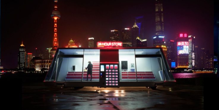
Image credit: Moby
43. Moby
This Shanghai 24-hour convenience store prototype has no staff, no registers and has been designed on wheels in order to eventually drive itself to a warehouse to restock, or to make customer deliveries.
To enter the store customers have to download an app on their phone. They can then either scan anything they wish to buy or add it to a smart basket which tracks their purchases. Once they leave their card is automatically charged for what they took. The product assortment is focused on fresh food and other daily supplies, but customers can order other things using the store’s AI for pick-up next time they visit.
Not only is the tech interesting, but a small store with wheels could have big implications once autonomous vehicles are allowed on the roads – whether that’s making deliveries or serving rural areas where a permanent store isn’t feasible.
44. Farfetch Store of the Future
Having recognised that most luxury purchases still take place in-store, but that the sector could still benefit from digital innovation, Farfetch unveiled its Store of the Future concept. The platform links the online and offline worlds of a retailer to enhance the in-store experience. This includes customer and product recognition, digital changings and a sales associate experience.
The system uses the idea of an opt-in data-sharing log-in in the Farfetch app, which stores a customer’s online and in-store shopping activity. When a customer uses the log-in in-store, the sales assistant gets a notification with all their background in order to provide a more personalised experience.
The Store of the Future also uses RFID and ultrasound to recognise products picked up and automatically adds them to a digital in-store list. This list can also be accessed in the changing room, where customers can request different sizes, colours and products, and even buy directly through the connected mirror.
The Store of the Future solution is modular so brands can pick and choose which bits most make sense to them and their customers. This remains a major factor in the implementation of digital in-stores – not all tech is created equal and not all tech is useful for all purposes.
45. Ikea TaskRabbit
Last year Ikea bought contract labour marketplace TaskRabbit in a move that brings more service to its offering. As everyone knows, the Ikea model is built on flat-pack furniture which requires customers to put together their purchases when they get home – sometimes with difficulty.
Now Ikea can harness the helping hands of TaskRabbit’s users to offer on-demand services to its customers who want some help with assembly. The company also believes the acquisition will help it improve its digital offerings. It’s another example of how retail is moving beyond a transactional relationship and into something broader. Brands who can offer value-added services and experiences will be seen more favourably by shoppers.
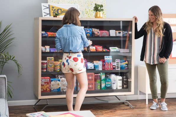
Image credit: Bodega
46. Bodega
Something of a controversial idea, not least because the bodega name refers to the grocery stores you find on every corner in the US, Bodega are five-foot-wide pantry boxes stocked with non-perishable items targeted at communal buildings such as gyms and office blocks.
The box is unlocked via an app and computer vision-powered cameras register anything picked up. The cost of the items are then automatically charged to the customer’s credit card. The machines learn from what is selected to keep tweaking the product assortment so it’s representative of the 100 most-needed items in that community.
Designed as a way to quickly pick up things you might have forgotten, the fear is that Bodega will take away from staple community stores, but it shows just how disruptive new tech can be to old models. And the opportunities that throws up.
47. ASOS visual search
Visual search has been a huge growth area, but it’s still interesting to see who is making moves in that space. Major online fashion force ASOS is one of those movers having added visual search to its iOS app. Customers can take a photo or upload one from their gallery, focus it on the item they’re interested in and then search ASOS’ catalogue to find something similar.
Apparently 80% of ASOS’ traffic in the UK comes from mobile devices, so it’s a potentially lucrative move for the brand. It’s also a reflection on how consumers now like to shop. Being able to use a photo rather than language can help ensure better and more relevant results faster, which may pay off for retailers in more sales.
48. EON.ID
EON-ID is a start-up using RFID and the Internet of Things (IoT) to improve garment recycling and reduce waste to landfill. The RFID tags can be incorporated at the start of the manufacturing process and then followed the whole way through the supply chain. Anyone scanning them can find out what the product is made of, who the brand is and access next-life instructions – whether that’s resale, donate or recycling.
It also makes sorting textiles much easier and faster when they are being recycled as companies know exactly what is in them. It’s another great example of how RFID and connectivity can change what we buy and our relationship with products over their lifespan.
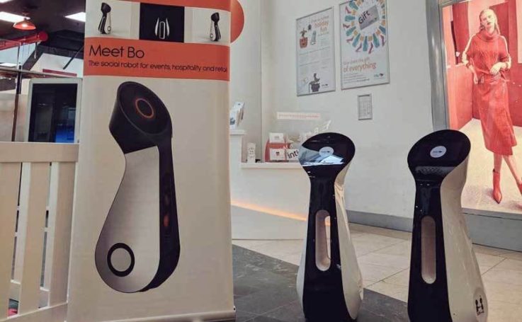
Image credit: BotsAndUs
49. Bo the Shop Bot
Europe’s first ever shopping centre robot Bo took over intu Milton Keynes shopping centre in a trial last year. Created by robot specialists BotsAndUs, Bo helped direct shoppers to different parts of the centre, collected feedback about their shopping experience and told them about special offers at Starbucks and Pret A Manger. The latter was to test the potential of tech to drive shoppers to specific locations.
The experiment is a fitting foray into the use of robots in retail. Having a robot in a large, multi-store space like a mall makes more sense than a small, individual store, and wayfinding and feedback are ideal tasks. This type of deployment could free up staff to do more complex or valuable tasks.
50. Neiman Marcus
Potentially seen as a small development, Neiman Marcus’ new system to deliver a customer’s online browsing history to its in-store sales assistants could actually be quite significant. It means that the associate can offer a much more personalised in-store experience, with recommendations influenced by the customer’s online activity. It’s the type of omnichannel experience that retail has long been talking about, but has been slow to implement.
Some customers may find this level of tracking uncomfortable, which is why Neiman Marcus gives customers the ability to opt out if they want. However, if retailers can demonstrate the value of this type of information-sharing, by offering better recommendations and conversation with customers, then many may be happy to take part.
Don’t miss our round-up of all of the very best bits of the blog from 2017, plus year-end insights from 36 top retail experts to set you on the right track for 2018.
If you want more content like this, or to keep up with the latest retail trends, click here to join our community.

