50 best uses of visual merchandising in retail

Whilst retail design sets the stage, visual merchandising is the key to engaging the customer with great product. It’s an art and science that combines ergonomics, lighting, spatial awareness and styling to inspire product handling and upselling. From window displays to in-store set-ups, here’s our edit of 50 best-in-class examples (in no particular order) of the power of visual merchandising to enhance a range. We’ve nominated our retail stores for their innovation, inspiration, storytelling and customer experience.
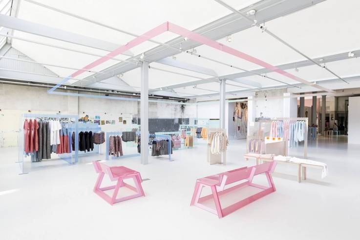
1. Esprit (Amsterdam)
To celebrate the collaboration between Esprit and Opening Ceremony, the team created a pop-up store concept inspired by the distinctive late 1980s palette of the Esprit brand. Casual jerseys are merchandised onto sugary pastel-coloured acrylic fixtures created from a specialist plastic called Myst. The material absorbs the light creating an ambient glow that offsets the summer-casual feel of the collection.
2. Hills Avenue (Tokyo)
In place of conventional shoe racks and shelving, the products in this Japanese footwear store are artfully displayed in a ‘floating’ white forest installation by designer Tokujin Yoshioka. Relaying the concept of ‘walking on air’, the merchandising is a metaphor for the unique ultra-light technology used in the shoes. Thanks to floor-to-ceiling windows flooded with light, the display doubles up as both a window and in-store display.
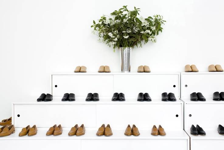
3. Everlane (San Francisco)
The San Francisco headquarters and showroom of US basics label Everlane seeks to embody its philosophy of ‘radical transparency’ in its approach to merchandising. Pared back rails, minimal fixtures and natural light in an open-plan warehouse space perfectly complement the back-to-basics ethos of the apparel on display.
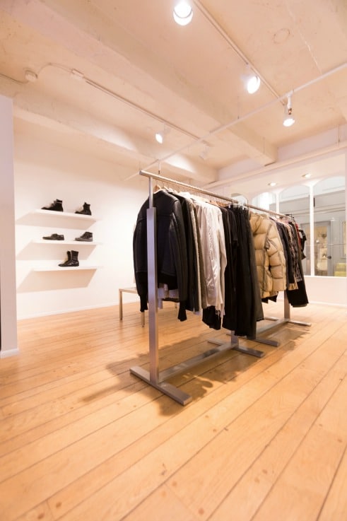
4. Abeyance Store (Portland)
Abeyance is the retail brain-child of 17 year old Liam Philips. The resourceful young entrepreneur displays each of the meticulously curated items in his independent store like exhibition items – solo, on plinths and in windows. The consignment store features designer pieces from the likes of Rick Owens, Ann Demeulemeester and Comme des Garcons.
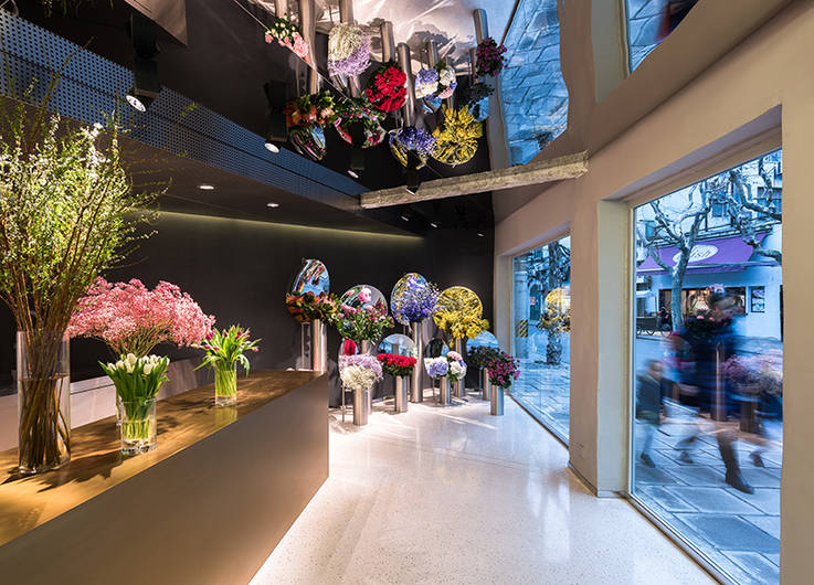
5. July’s Flower (Shanghai)
Large ceiling and window mirrors are positioned at strategic angles creating reflective ‘special effects’ of the blooms on display in this unique flower store. This simple device is used to amplify the colour and forms of each alluring bouquet.
6. Congruent Space (Chicago)
Congruent Space writes its own rulebook and defines fashion merchandising on its own terms. It seamlessly integrates art and fashion creating retail displays around artistic installations – and vice versa. A range of colourful beach-palette hoodies might inspire an equally colourful sand installation. A graphic black and white backdrop may serve as both a photo studio and a retail display.
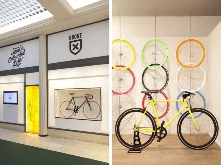
7. Broke Bikes Deli (Antwerp)
Designed by Nightingale Studio, the Broke Bikes Deli invites visitors to custom design and build their own brightly coloured cycle. Each area of the store is merchandised by bike part, suspended from the ceiling in clear and colourful formations, showcasing product at its best.
8. Papersmiths (London)
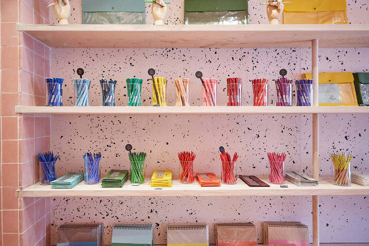
Humble writing paper is elevated in a unique store by interiors agency Studio B, housed in London’s shipping-container department store, Boxpark. Stacks of paper, pens and other items are merchandised within trays and shelving inspired by its design-led textures. These textures include recycling-inspired speckled jesmonite and chalky tiles creating an immersive paper-inspired experience.
9. Denham the Jeanmaker (Sydney)
Denham manages to create ‘immersive’ denim stores without the usual visual tropes – installations made of denim and the like. Instead, it emphasises its premium material offering and industrial, work-inspired aesthetic by highlighting different jeans in ‘exhibition’ style spaces, merchandising product with tools and haberdashery and centering the store around a workstation to make alterations.
10. Hermes Rive Gauche (Paris)
Luxury is embodied in the Hermes boutique Paris, housed in a former 1930s swimming pool. A discrete portico, leads to a voluminous space with a series of ashwood huts or pavilions, each holding a different collection. The space becomes a surreal organic universe that customers traverse to explore different stories within.
11. BbyB Chocolate Shop (Tokyo)
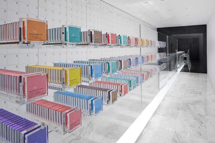
At BbyB, chocolate is presented as more of a pharmaceutical necessity than a confectionary counter luxury. Uniformly square chocolate bars in pastel colours are lined up in clear perspex drawers which customers must interact with to select their chocolate. Thirty types of chocolate, each with their own drawer, make up a 40 feet long wall and feature cabinet that beckons to be explored (and tasted).
12. Urban Outfitters (New York)
Fifty-seven thousand sq ft of space allows for multiple mini shop-in-shop displays around different product themes. Whilst the space is divided by distinct categories for beauty, homewares, vinyl and books, each space is further sub-divided by visual ‘tribes’ from vintage baseball to Coachella campers.
13. Littlesmith Jewellery (London)
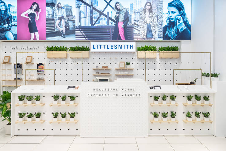
Within the densely-packed displays of Topshop Oxford Circus, design firm Aberrant Architecture has created a stand-out retail display for bespoke jewellery start-up Littlesmith. Inspired by a jewellery workshop, the fixtures are created from perforated plywood flats which can be interchanged to adapt to displays. There’s also a desk for ‘retail theatre’ as customers watch the making process of their designs.
14. Christian Louboutin (Miami)
Stepping inside this Christian Louboutin store is like stepping inside a fantasy dress-up box. Shoes and handbags are displayed whimsically – escaping from hat boxes or tumbling like hidden treasures. The merchandising supports the opulent interior design with shimmering stained glass windows, red velvet staircases and plush wall coverings.
15. Cotton Republic (Beijing)
Cotton Republic has made theatre out of the humble sock. Colourful cottons are wrapped and stacked in metallic tubes, sparing displayed around an eye-catching installation. Rather than racks of cotton undergarments, the presentation borrows more from a luxury drinks store.
16. Beauty by Boozt (Roskilde)
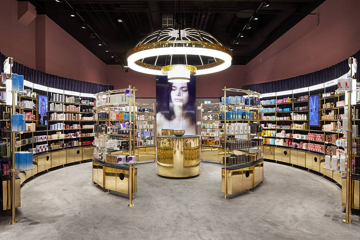
Online retailer Boozt.com has created a physical store space for its beauty offering in a plush and tactile series of premium retail displays inspired by opulent 1930s Art Deco. The space is designed to feel more like a home with plush carpeting, products displayed in flattering, illuminated trophy cabinets, and one cash register discretely concealed within furniture. Sales associates carry handheld payment tablets making interactions feel more like a personal shopping service.
17. Selfridge’s Body Studio (London)
The Body Studio department is dedicated to sportswear, sleepwear and underwear. The choice of mannequins are key to the concept, depicting close-bodywear on a variety of diverse, active and empowering body shapes. Each type of bodywear is presented in sub-environments that reflect the lifestyle. Sportswear is suspended on gym-inspired equipment and loungewear within Japanese ‘tea house’ panels. Lighting is finely tuned to create the correct ambience around each section.
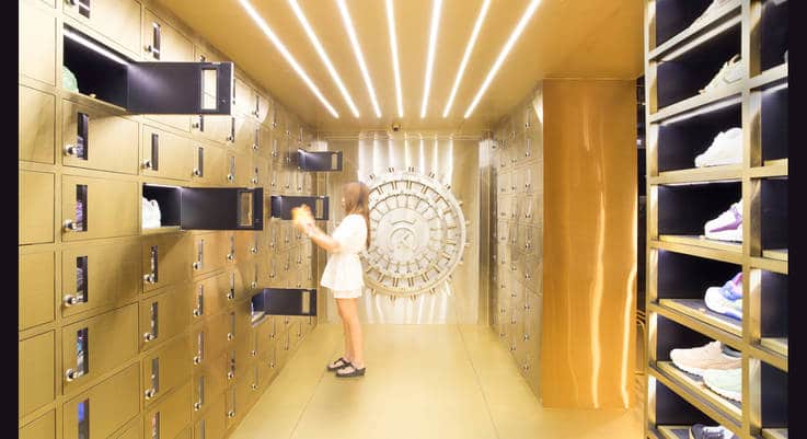
18. 24 Kilates (Bangkok)
Luxury sneaker brand 24 Kilates opted to ‘display’ its coveted, limited edition sneaker product in floor to ceiling safes and lockers, inspiring customer interaction by actively exploring each unit to uncover the hidden treasures. Adding to the mystique further – the store is an extension of a private business-owner’s home in a residential area.
19. Queen Mama Market (Seoul)
Over seven floors, this South Korean concept store retails a generous selection of luxury homeware, men’s and women’s fashion and gardening product. Each spacious floor has a completely different look and feel and the merchandising for every item is meticulously considered. Products are suspended from the rafters, styled on fixtures in a collage of contrasting materials, arranged on mannequins like exhibition displays making each and every item feel like a unique find.
20. Johnstons of Elgin (London)
A lesson in colour-coordination, the London flagship of luxury Scottish cashmere manufacturer Johnstons of Elgin displays its tactile pieces by colour tone. Oatmeal and neutral separates are ranged together and eye-popping coloured pashminas are displayed in an array of rainbow shades. Warm lighting accentuates the softness of the luxury material.
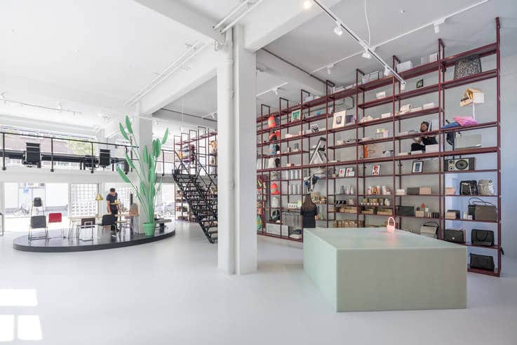
21. Groos Concept Store (Rotterdam)
Groos is a contemporary art and design store with an eclectic range of product from across the globe. To handle the diversity of the product on offer, each item is awarded its own space on a custom-built floor-to-ceiling shelving grid. Merchandised in this way, each item is not only clear to view but feels individually curated and celebrated. A mezzanine level offers access to the higher shelves.
22. KITH (Brooklyn)
A true destination for streetwear pilgrims, KITH Brooklyn showcases its premium sneaker product like trophies. Part of a futuristic store design, products are presented in clear perspex cases and trophy cabinets and the whole space is illuminated to feel like an engineering lab. Pilgrims are rewarded (and encouraged to dwell) at the KITH treats cereal bar.
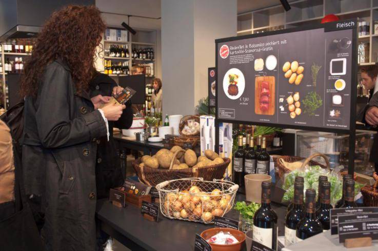
23. Kochhaus (Berlin)
Kochhaus communicates its deliver-to-door meal subscription through a physical retail space. Unlike a conventional grocery store, it displays its product by recipe rather than food group. Produce and instructions are collected and displayed in tables, just like they would be on your kitchen counter at home. Everything needed for a meal is centralised in one place with a revolving menu of up to 18 recipes on display at any one time.
24. Swarovski Crystal Lab (Dubai)
Swarovski crystal product is displayed like precious treasures within copper ‘jewellery cabinet’ display fixtures. Handbags are hung like pendants from their own plinth-top structures, apparel is in-laid like the interior of a trinket box.
25. Pop & Suki Pop-Up (Los Angeles)
Pop & Suki’s moveable pop-up shop takes the form of a giant trunk which unhinges to reveal handbags, luggage tags, cosmetic cases and belts individually hooked onto pegboards – all in ‘Millennial Pink’ of course.
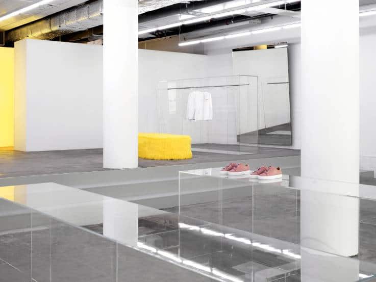
26. Axel Arigato (Stockholm)
Customers are encouraged to go deep into a cavernous white warehouse to explore the products by premium, handcrafted sneaker label Axel Arigato. Each product is given breathing room on low-fi perspex tables and ultra-minimal wardrobe rails. Warm yellow colour-pops are used as interest points around the space from yellow fur seating to illuminated yellow changing rooms.
27. NikeLab LDN 1948 (London)
Nike1948 is the sneaker-freaks holy grail with highly limited edition products, exclusive collaborations and experimental designs. Displays evolve regularly and boldly in response to the ever-changing product stories. Think elegant, decorative wall coverings and floristry for the ‘Liberty London’ collaboration and futuristic lighting and neons offsetting technical Dri-Fit jackets.
28. Nitty Gritty (Stockholm)
Nitty Gritty reads like an inventory of the modern gentleman’s perfectly curated wardrobe. Shelves and archive tables are set out in pre-organised outfits with polished shoes sitting next to a matching sweater, a set of complementary tie options and a freshly pressed shirt. Bags are co-ordinated expertly with footwear and a vanity cabinet is set out with neatly aligned grooming products for the finishing touches.
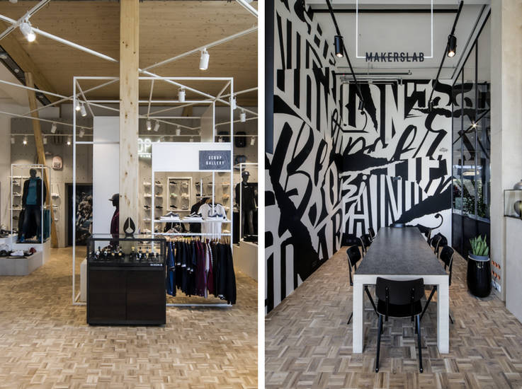
29. ‘Scoop (86) (Luxembourg)
‘Scoop (86) is a hybrid retail store and club that offers sneaker-fans a reason to come in store by creating a ‘community’ offering. Mini exhibitions and audio tours reveal the making process behind the shoes and customers can request personal touches to their shoes at the ‘maker’s lab’ whilst they enjoy a drink.
30. Paper City (London)
Premium paper brand G.F Smith has embodied the art, craft and colour of its prestige products in a London showroom space. The extensive paper range, framing services and binding services are expressed via a series of installations and engaging exhibitions.
31. Rent the Runway (New York)
Online designer-hire retailer Rent the Runway have a ‘Style Studio’ space within its NYC offices shoppable to anyone by appointment. The space is merchandised like a stylish friends’ apartment with a lounge area, kitchen tables and wardrobe-style merchandised rails of clothing. Guests can opt for one of six different personal styling appointments ranging from a rapid 30 minute refresh session to full scale group bridesmaid consultations.
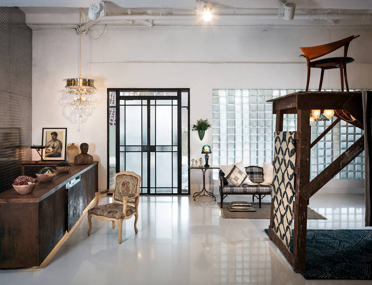
32. Bungalow 8 (Mumbai)
Like walking into a grand home, contemporary homewares, interiors and textile pieces are displayed in carefully considered assortments – creating a portrait of modern Indian taste. Antiques sourced from all over India sit alongside avant-garde labels, quirky one-off finds and other design curiosities.
33. The Apartment (Copenhagen)
Twice the doors open to a beautifully restored 18th century shoppable apartment, and living installation of 20th century furniture, contemporary art and design. Under the curatorship of Tina Seidenfaden Busck, the home is a place to discover stories around private consultations or exclusive dinners.
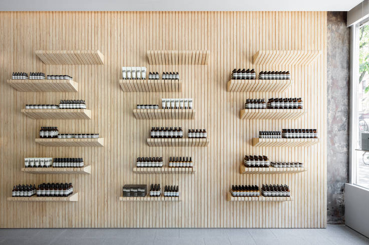
34. Aesop (New York)
We couldn’t run a blog on top visual merchandising without mentioning Aesop. Whilst the store design is constantly re-invented and site-specific, the Australian brand has worked hard to create what is now a signature ‘apothecary’ style approach to its merchandising. Each of the dark brown bottles is meticulously lined up on pine shelving, supported by a sink in every store to actively encourage product sampling.
35. Tesla (Sydney)
Tesla’s in-mall retail spaces are as focused on building hype around its distinctive product as they are on securing sales. Interactive content gives visitors the chance to get close to the making-of-the cars, whilst the in-store Design Studio invites active play, experimenting with paint colours, seating, decor and other finishes.
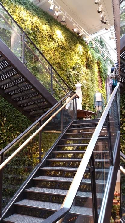
36. Anthropologie (London)
Anthropologie’s merchandising is core to its brand identity. Each of its discoverable store layouts read like unique vintage emporiums with treasures stacked and buried over display tables, cupboards, cabinets and rails. Clever tactics throughout the stores make for a customer-optimised experience – furniture and racks align at 25-40 degree angles to create ‘satisfying symmetry’ and discounted sales are placed in separate rooms. The stunning living wall adds to the natural brand ethos.
37. Etude (Seoul)
Beauty brand Etude’s flagship store is an interactive beauty destination dubbed the “House of Colour Play”. Guests are encouraged to explore the candy-store style cosmetic displays and socialise around a flatteringly illuminated community table in the centre. The whole space is peppered with digital features that support the merchandised product from My Colour Finder shade matching, how-to tutorials and DIY lipstick blending services.
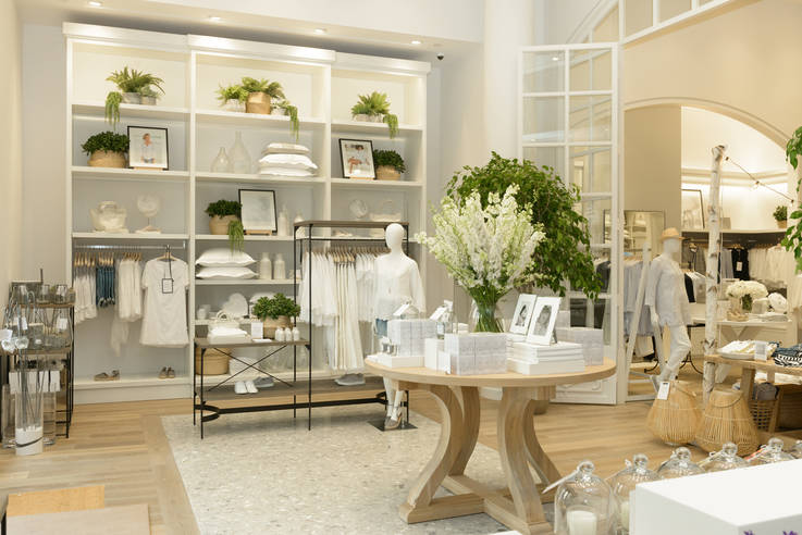
38. The White Company (New York)
How to merchandise all-white product? Alongside a little help from spectrum neighbours grey and beige, The White Company showcases its neutral offering with well- illuminated, well-spaced interior vignettes. Gracious use of plants add colour pops and visual texture.
39. Bolon (Stockholm)
Rug and woven goods brand Bolon’s “Lab Store’ is designed as a collaborative, community space for designers, architects and interior designers to experiment with the brand’s product and technology. Products, yarns and woven fabrics are presented in inspiring displays to provide backdrops to lectures, workshops and supper clubs catered by the in-store chef.
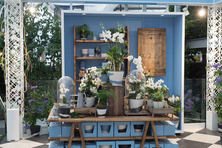
40. The Wedgwood Conservatory (London)
The iconic British tableware brand has merchandised its decorative products within an immersive English country garden inside Chelsea’s Peter Jones department store. Bringing the heritage of the brand to life, the store windows are dressed like conservatory glass peering into trees, butterflies and birds. Experientially, the product is brought to life in a series of afternoon teas.
41. Rchmnd (Halifax)
A lesson in simplicity, Canadian premium streetwear store Rchmnd emphasises the highly-curated approach to its product mix by displaying merchandise like gallery artefacts in an all-white space. Apparel features on two simple rails, one on the left wall, one on the right with a series of plinths for smaller items and footwear down the middle. There are no window displays, instead the pristine white interior appears to glow (and lure in) from the outside.
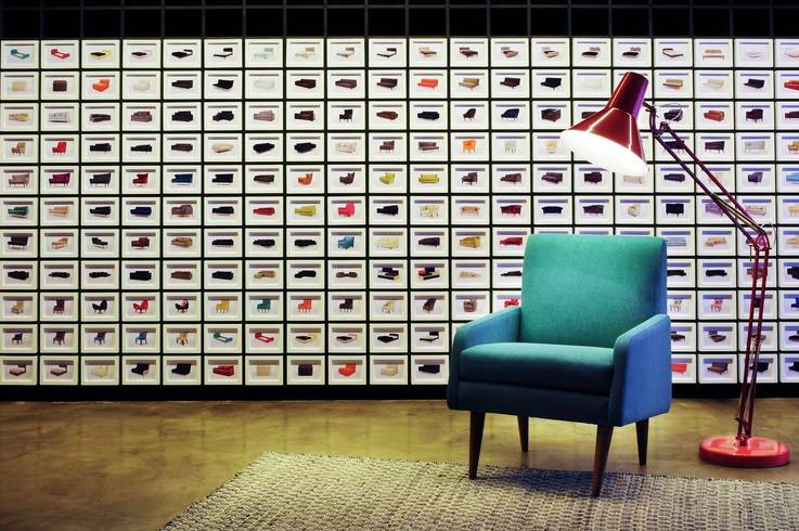
42. Made Showroom (London)
Online home furnishings retailer Made.com expertly brings its extensive digital offering to life in physical retail. A selection of product is styled in a series of ‘at-home’ scenes whilst full scale digital projections rotate with different pieces. Each product is accompanied by a postcard and fabric sample for customers to take away for reference.
43. Apolis: Common Gallery (Los Angeles)
The Apolis: Common Gallery in downtown Los Angeles presents products as mini exhibition displays that explain the provenance and product stories behind its sustainable, ethically-sourced designs. Product is supported by illuminating storytelling wall graphics and copy.
44. CORAZYS (Tokyo)
Home store, ‘Corazys’ takes its cue from a library layout with its range of small homeware items, stationery and collectibles arranged by colour and tone in a store full of floor to ceiling shelving. Orange, pink, green and blue are the leading colour themes – the rest of the store is neutralising white. Every single item is of pure colour – either block or gradient.
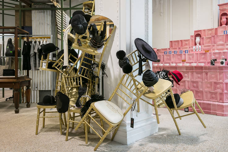
45. Dover Street Market (London)
Dover Street Market is defined by both its product curation and its visual merchandising. The merchandising for each designer collection or cluster of products is given a bespoke treatment, creating diverse experiences under one roof. The spacial design, hanging styles, colour palettes and graphics are crafted to best showcase the identity and spirit of the product range.
46. L’OCCITANE (New York)
L’OCCITANE’s New York store is setup to reflect increments of time. The front portion of the store is merchandised with grab’n’go product for stopping by. The middle section is for browsers open to exploring the brand via engaging displays. The back of the store is designed for a brand immersion in a ‘private garden’. Here, customers can sample the product in a ‘smart beauty fitting room’ with touch screens, mirrors and stone sinks allowing customers to browse the range digitally and request products to test.
47. Hostem (London)
Inspired by the world of architecture and sculpture, the team at Hostem has created a simple space-within-a-space within their luxury concept store. Apparel from a variety of designers, in a variety of styles is merchandised in one continuous rail that trims the length of the whole space. Intermittently, where applicable, shoes are merchandised into the mix on small plinths.
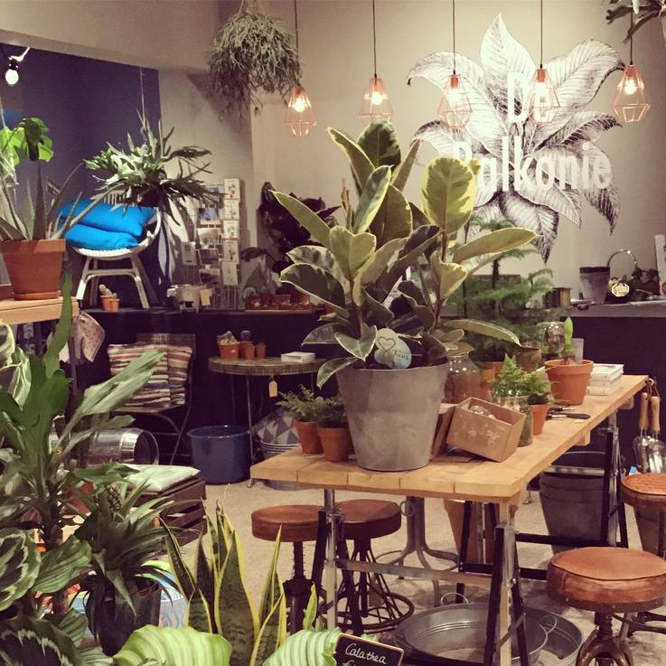
48. De Balkonie (Amsterdam)
This Amsterdam boutique is dedicated to the urban garden, specifically the balcony. Styled like an interior homewares store, individual pots, hanging planters, crates and display tables are clustered in a dense assortment. Plants are merchandised with cushions, vases and lanterns for al fresco inspiration.
49. Apple (San Francisco)
Apple embraces biophilia, supporting its clean technological product with lush leafy green tree planters which double up as a comfortable benches for customers to browse and relax. ‘The Avenue’ is a feature currently exclusive to this store dedicated to the display of accessories.
50. Apartment by The Line (New York)
One of the pioneers of ‘shoppable apartments’, The Line is a highly curated and personal selection of objects from the worlds of fashion, home, art and beauty. The objects are displayed in a storytelling context within a home environment. Customers can arrange to visit the Apartment by appointment where they are open to browse or benefit from a complimentary consultation.
For more inspiring physical retail spaces don’t miss our 2017 update to the top 50 concept stores in the world. Or come explore stores like this on one of our Insider Trends retail safaris.

