How PLP Architecture is designing physical spaces for the future
The issue with trends is that they can be quite short-lived, or quickly surpassed by another. It’s one thing to try and manage trends in retail, but how do you take them into account when designing something that might stand for decades? It’s a challenge that PLP Architecture knows well in its work to shape the built environment.
To think about the future of retail stores we need to think about the future of physical space as a whole. Tina Qiu, Senior Associate Partner, shares her insights into how adaptability is the name of the game and how retail design is changing to accommodate the future:
Tina Qiu, Senior Associate Partner, PLP Architecture
Could you describe what PLP Architecture does in a nutshell?
PLP is a number of creative cells that work together in a collaborative manner towards a common end – shaping the built environment. We have architects, designers and specialists in certain areas such as graphics, augmented reality and virtual reality, plus research groups that look at ways to help our clients interpret trends, find innovative ways to use space and develop thought pieces which provoke discussions and debates.
More than ever today, we are focused on ways to promote interaction between people through the creation of spatial models. This is very important in retail as it is very challenging right now for high street retailers to find new ways of making their stores an attractive destination.
Are there any retail-related projects that you’ve worked on that you can tell us more about?
Recently we have been creating the shell for the new Adidas flagship store in London. Our role was to shape a container in which a variety of retail experiences could take place and evolve over time and curate spatial environments to reflect Adidas’ concept of lifestyle living.
Externally, we focused on the notion of how you promote interaction with passers-by. The challenge of the store façade is to ignite and excite. Store windows have become a form of public street art. Interaction by day, museum by night. Not only does one need to create foot traffic but differentiation and purpose. It is a unique opportunity to connect the inside of the store with the outside consumer and draw them in. So the creation of super scale shopfront windows which connect to the inside was very much our theme.
What have been the biggest challenges?
For Adidas, we are trying to create a volume that could allow Adidas to curate as they wish for the next 20 years. Retail concepts change so quickly that you do not want to end up with a space that is inhabiting to client engagement. There needs to be flexibility in the retail store and so structurally it needs to allow morphing and adaptation of the fit-out to create human experiences such as pop-ups to drive social interaction and gathering places that enable the retailer to use the floor space for more than just sellable space, such as to host workshops or run fitness classes.
How do retail projects differ from other sectors you work in?
There are similarities but also some differences. In a lot of sectors such as medical research or office buildings, there are a fixed set of internal arrangements (lab and functional space) which are unlikely to change whilst trends are likely to change. In the retail sector everything is up for grabs all the time. Technology has made us more aware, knowledgeable and savvy as shoppers and retailers are fighting against e-commerce and having to rethink the purpose of physical stores and its architecture.
You get a lot more space change and movement in retail compared to office spaces. But we always approach it in a similar way. There is a rule to the fixed arrangements first and then you see what the client vision is and understand what the goal is and the challenges.
Does having some constraints or restrictions mean more creative solutions than an open brief?
The interesting thing about design is that you can always design it in. But it’s also interesting to pick up something quite rigid and try to transform it into something special for a different use. The more challenging it is the more interesting the design outcome.
In London there are many restrictions such as listed buildings and all these guidelines for planning. Sometimes that in itself creates a form to start working within. With the Adidas store, for example, we’re working with existing building materials and structure we have inherited.
There were a lot of columns and beams in the building and actually when we stripped it all out and we looked at it we thought that ‘Adidas quite like this raw kind of feel’. That was never one of the points in the brief. It’s just something that you understand and learn about the site you get and try to adapt into your design. Sometimes you do create something special without knowing that you would at the beginning.
How far into the future do you look when you are working on a new design?
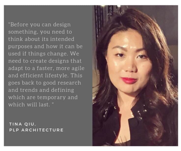
You spend a lot of money, time and natural resources to create something, so it is important that it lasts – something that can adapt to the future because our lifestyle changes so fast all the time. Before you can design something, you need to think about its intended purposes and how it can be used if things change.
We need to create designs that adapt to a faster, more agile and efficient lifestyle. This goes back to good research and trends and defining which are temporary and which will last. It does look to the past, as well as looking to the future, to see what’s coming back.
How is this vision of the future impacting your designs?
It is pretty clear that retail and the high street is being challenged by e-commerce and therefore undergoing a more impactful evolution in its history – 24-hour access to shopping! But 85%-90% of purchases are still made inside the walls of a physical retail store. So the question becomes – how do you make these places appealing for people to come visit?
Shops are morphing back into great assembly places that need to be tech-savvy, merchant-driven, sustainably built and also create centric shopping experiences. We used to see concept stores five or six years ago where you had coffee shops in bookstores and then this moved onto coffee shops in retail stores.
Now retail is branching out even more. Gucci in Florence is a museum/store/restaurant all integrated into one. Big brands have adopted the terminology of concept store to concept living from the Armani Hotel in Milan to the Ralph Lauren restaurant in Paris. It’s not just one single use, but this hybrid.
It’s what do you do to retail stores to make them more attractive? Do you start integrating other experimental and cultural experiences? Should it become one big exhibition space or a community space? Formats of retail spaces need to allow enough flexibility for the brand to better steward its ethos.
Do retail clients come to you with the same brief as they did five years ago?
All of our clients across every sector are thinking differently. Everything is moving very quickly. Technology is having such a huge impact on us in our everyday lives. Clients are not only thinking differently about their brief; they’re also looking to create a different response than they did 5-10 years ago.
How do we incorporate alternative uses to attract footfall like food venues, entertainment, music, experimental services, co-working spaces that might target freelancers or entrepreneurial start-ups that need a home on a rental basis. More of our clients are willing to take a risk on something than they were in the past and try to make collaborative relationships. The design of spaces has become less formal than before.
The new thing is about ‘how do you make it flexible?’ Clients are asking ‘how do we fit-out spaces that you can quickly turn over for different uses?’ Or ‘I want to sell on this floor, but then if later I wanted to lease it to a start-up that we’re collaborating with how do I do that?’
We do think about how walls and partitions can move about, so the way you walk around a space is also different on a day-to-day basis. How do you create almost temporary spaces in a permanent space?
That’s becoming more apparent now than it was even two or three years ago. We are creating more large spaces and volumes that allow for flexibility in the fit-out rather than small alcove spaces that are quite inflexible to change later on.
For retailers it’s more important to create sensory environments. Luxury does not necessarily have to mean an expensive finish. It is more important to excite and promote social interaction.
It depends on the brand, what the ethos is and how they work. Some retailers are not quite so engaged with e-commerce because their ethos is that intimate face-to-face dialogue. If that’s the case, then the architecture is more focused on returning clients and retaining customers. Whereas if it’s someone like Adidas who is very in touch with e-commerce, then it’s about how the store works to accommodate that. Regardless of what people are selling they want the architecture to be memorable and the spaces inside to be flexible.
Are there any common threads between retail spaces that you personally are enjoying?
As an example, the Sonia Rykiel store takes on the concept of café/library/store, where the interior walls are clad with books floor-to-ceiling to create an intimate environment like walking into Sonia Rykiel’s studio.
You have to really be true to your brand to really shine. If you’re true to your ethos and you find new ways to adapt it to the modern-day standard that makes it more interesting. You want to come back and you remember it and you talk to people about it.
What sort of changes (cultural, social, environmental etc) do you take into account on projects?
It’s changing all the time. It’s about how you blend environments. It’s more about interactions, technology, experiences and sensory places that trigger a wider integration with cultural needs.
For example, if we develop an office building then what do we create around that so it’s almost a community or hub? You can put in somewhere for people to go to lunch, but then how do you make it a social space that people outside can come and use as well? We do think a lot beyond just the spaces that we’re creating to integrate them and see how they impact the community itself.
What are the biggest differences that you can see in how we might use physical space in the future?
Shops are morphing back into hubs where the community gathers and the architecture needs to serve a central assembly of marketspaces that is tech-savvy, sustainably built and designed to create centric shopping experiences. But they will need to stay authentic and true to the brand. Take a walk down Soho in New York and you see some stores integrating robot demonstrations of products being made. Sometimes you don’t know if you are in a store or a lab. But it’s fascinating and draws you in.
Whenever we do an office or residential building there are elements of retail in that. It might not be a store that sells clothes. It might be a food store, cafe or something that instigates constant footfall. We want people to use the architecture because we want it to be very regenerative.
I think flexibility and adaptability are the key words. How do you keep on adapting it to make it intimate and socially interactive? You can do that through the space, or you can do that through the marriage of two different entities. That’s really what’s going to be the trend in the next couple of years. Beyond that we shall have to see how technology affects us.
What would be your top tips for a big brand with a large store portfolio if they came to you and asked ‘what do I do with my stores’?
We would tell them to OPEN UP! Find ways of making people want to go there. Strike alliances with other retailers that are not readily identified with their trades and create new interesting destinations and experiences.
Get more design inspiration from these 50 top luxury stores from around the world.
Want to quickly and easily connect with the players kick-starting trends and inventing the future of retail? Find out how you can transform your team’s thinking using Insider Trends’ little black book here.

