How will retail store designs change post-Covid?
Your retail store design has never been more important.
Or potentially such a handicap.
Lockdown restrictions may be lifting all over the world, but the Covid-19 pandemic is far from over.
This means getting customers back into stores is a two-fold challenge. There’s the emotional aspect (do customers feel safe returning) and the operational aspects (can the store made be safe for them to come into).
It’s here that your current store design can either work for or against you in terms of how easily it can be adapted and how many shoppers you can safely accommodate.
But the way stores are designed isn’t just changing in the short-term. Coronavirus is likely to be the catalyst for future retail design concepts in many different ways.
What might stores look like in the short term?
Non-essential retail spaces in the UK have now been given the ok to reopen from mid-June. But while retailers may be keen to welcome customers back, the question of how stores can be operated safely while the pandemic is still ongoing is a big one.
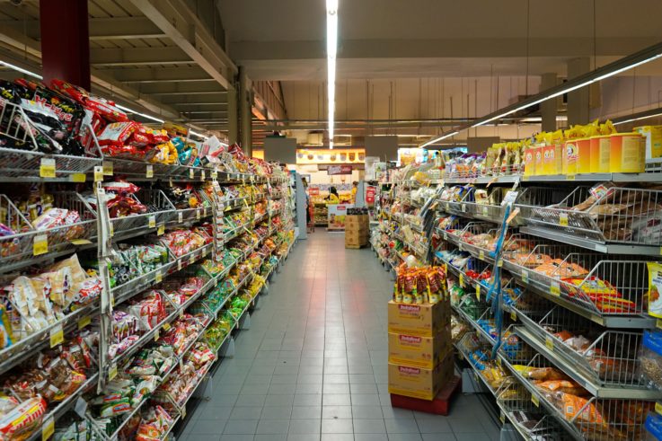
In the short-term, retail store design will be all about retooling the space to enable social distancing. Grocery and other essential stores have had a head start on figuring out what works and what doesn’t, so it’s likely most retailers will be borrowing best practice from them.
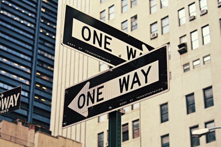
This includes installing protective barriers at checkouts, marking out where people should queue, implementing one-way systems and reducing the number of products on display to create more space.
In a shift away from the open sightline approach taken in many newer store designs, we may also see the installation of dividers in spaces to channel customers to move around it in a certain way. Signage will play a bigger role than ever before in helping customers navigate any changes to the store layout, but also in reminding them of distancing measures.
Another factor is that retail stores are typically designed to draw the customer further into them and to encourage them to spend more time in the space. This design is now at odds with what many people are looking for in their shopping trips.
It’s expected that speed and efficiency are going to overtake browsing in terms of importance when visiting stores. Therefore, retailers should be thinking about the types of journeys that may be bringing customers into the space and configuring around that.
For example, click and collect is likely to continue its upwards trend. Returns are also another big driver of store visits. Creating separate and clearly marked parts of the store for those transactions to take place would help speed up customer journeys.
Retailers who have adopted a more experiential approach to their store design may continue to benefit even when the in-store experience shifts from crowd-pleasing to fast purchasing.
This is because ‘experiential’ spaces tend to be designed with greater flexibility. This may mean moveable fixtures or the ability to make different pockets of space within the store. It may be that there aren’t fixed till points that might cause queues.
What can we learn from outside retail?
Retail isn’t alone in dealing with people in a contained space.
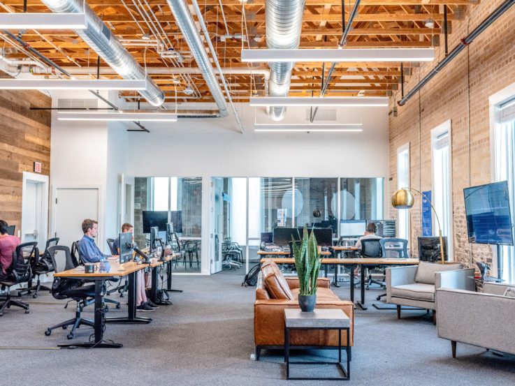
Offices all over the world are facing up to the challenge of getting people back to work safely. This is compounded by the fact that many people will be returning before a vaccine is available. As such, offices are having to be rethought to reduce the risk of staff passing the virus between them.
Cushman & Wakefield’s Six Feet Office concept has been devised inside the company’s own Amsterdam HQ and offers some interesting clues about how offices may look in the future.
As well as physically making sure desks have adequate space between them, Cushman & Wakefield has introduced visual elements, such as a six-foot circle of different colour carpet around the desks, to psychologically help people keep their distance.
It’s easy to imagine how this could translate into retail store design in the long-term.
At present a lot of stores are using gaffer tape to hastily mark out two-metre spacing for queuing but making this part of the actual store design could be a more attractive and elegant solution.
For example, there could be different colour circles or stripes in the carpet to show where each person should queue. Hard floors could have graphics or lines built into them. Customer service areas could be decorated in a specific colour to visually set them apart. It may even be possible to use tech to project lines for queuing.
There is an opportunity for brands to show their personality and values while creating a safe space for people to shop in.
What long-term retail store models might we see?
Any brand or retailer considering opening a new retail store in the next year or so is going to have coronavirus at the forefront of their mind.
However, many expect the pandemic to have a lingering impact on consumers and their behaviours. As such, it’s likely that retail store designs will feel its influence for a long time.
In fact, the retail store design of the future may well be more about ‘space’ within the space.
Streamlined and uncluttered stores will ensure that there is more room for customers to move around in and therefore not be so close to one another. They will also offer greater flexibility for retailers in changing layouts going forward.
One model that may become more familiar is the one-way system that IKEA has made famous. This will allow retailers to more closely control in-store numbers, but also presents a way to move shoppers through the entire store, which may push up purchases.
For some retailers it may even work from a showrooming perspective enabling them to have few products on the shop floor. Customers could note down what they want to buy as they go through to collect at the end as with IKEA. To minimise touching staff could demonstrate products to customers.
Another approach that may have greater relevance now is Target’s dual-entrance space in Texas. One side of the store is focused on quick grab-and-go journeys selling things like pre-packaged food and drink. The other side is more about inspiration and more leisurely journeys with products like homewares on sale.
The approach means that Target can cater to whatever the customer’s greatest need is at that time – efficiency or entertainment. It also means though that customers are not all in the same space together. Plus, the retailer has more flexibility over their operations.
For example, in the current situation in theory Target could close the inspirational side but keep the other half open for people to stock up on essentials. At the same time it could use the closed half as a mini warehouse for fulfilling ecommerce orders. Or it could retool that side to be a click and collect space.
Drive-through enabled stores could be another big retail design trend. Companies like Dixons Carphone are reportedly already developing drive-through pick-up points which prevent shoppers from having to enter a space to collect their order.
It’s not hard to imagine that a similar drive-through element may become a staple in the design of stores which have large parking facilities. The other benefit of these pick-up points is that with the right technology they could be accessible 24/7 so customers can get their order at their convenience.
Shop floors could also shrink as retailers look to ramp up their ecommerce and click and collect offerings. One existing model for this Argos which dedicates most of its square footage to back of house product storage. Customers can order online for delivery or choose to collect their orders in the store. The store also caters for walk-ins who can browse the companies catalogues and place their order then and there.
Smaller shop floors would lend themselves well to showrooming and experiences with retailers able to have some select products out on display. Endless aisle technologies and digital screens could enable customers to browse the full range of products. But equally if the space is more about stock then it can cater for the brand’s ecommerce customers as well offering quick collection or local delivery.
Material choices for retail stores may also change. Copper is well-known for its antimicrobial properties, which means it and its alloys could become a major feature in the store designs of the future.
Naturally there is a cost involved with this which means it may be more of a trend in the high-end and luxury sectors. However, any retailer could in theory benefit from using copper on high-touch areas of their spaces such as door handles.
Tech-powered store concepts may also become more dominant. The Amazon Go model of using your smartphone to access and leave the space, and a mix of smart shelves and cameras to automatically track your purchases, is attractive in a minimised contact world.
The three Fs of future retail design
The thing about the future is no-one knows for sure how it will play out.
Before Covid-19 customers were increasingly looking for retail stores to provide them with greater experiences. The pandemic has now seen the pendulum swing the other way towards optimised journeys over frivolity.
These two Fs – function and fun – are likely to both have a role in the store design of the future. But making them work requires a third F – flexibility. The more flexible your store design is the more easily you can adapt to what happens in the world around you. It means you can dial up the fun if customers want it and amp up function when it matters.
The one thing the store design of the future isn’t is fixed.
What’s the best next step for your retail business? Find out in 30 minutes or less – for free.

