Inside Primark’s innovative Boston flagship store
Primark is making its North American debut with eight stores launching in the US over the coming year. Our friends at Dalziel & Pow have collaborated with the company on an innovative flagship store in Boston. We take a look inside…

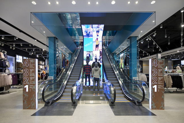
The design marries the history of the iconic Burnham Building with forward-looking tech across77,000sqft of retail space. The original features of the building, dating from 1912, have been retained, with exposed brickwork and terracotta ceilings.

Dalziel & Pow played a strategic role in this project, applying the brand in a new territory with limited recognition. The ‘Hello Boston’ mural in the store’s lobby, for example, illustrates Primark locations around the world as part of the brand’s international fashion story. Meanwhile, in-store digital screens continue this story through playful illustrations and shout-outs from Primark’s global community of users.
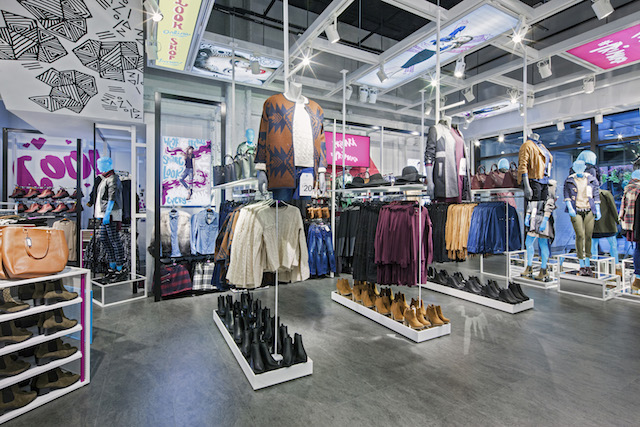
Visual impact is created through a collection of raised mannequins showcasing seasonal outfits. A high-definition digital LED ribbon offers a constantly changing sequence of bespoke content, emphasising the latest hot products.
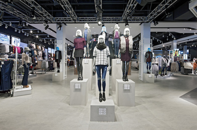
To aid the customer’s shopping experience, the store is fitted with 73 cash registers and 84 fitting rooms. There are a number of seating areas across the floors, as well as charging and free wifi.
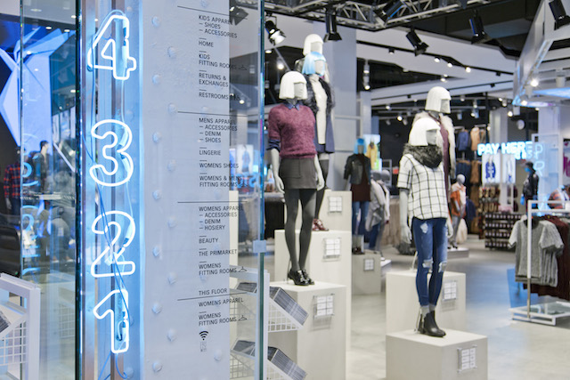
To really help time-poor, trend-conscious customers, another key feature of the store is the 1,000sqft trend room, showcasing the latest products and looks and offering a store-within-a-store.

A stunning physical experience, the store also encourages its customers to join the conversation beyond the store’s walls as part of Primark’s online user-generated ‘Primania’.
All images courtesy of Dalziel & Pow
Want to experience the world’s coolest stores? Join us on one of our retail trend tours.


