Good guidance: Dalziel&Pow on designing a physical presence for Missguided

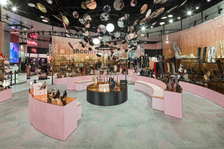
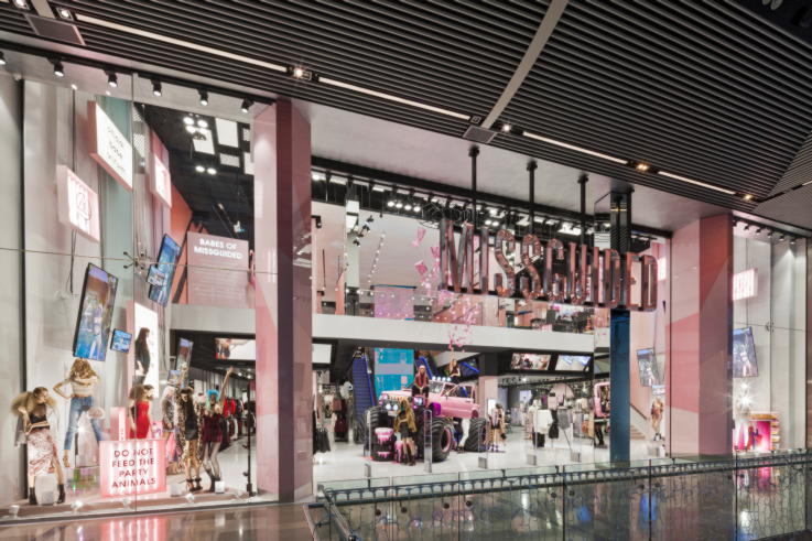
What does a young, vibrant rapid fashion brand with an online presence that reaches millions do next? If you’re Missguided the answer is to open your first flagship physical store. Located in the Westfield Stratford shopping centre in London, the store is a master class in creating an authentic brand experience that brings the online world to life.
With a second store already announced for the Bluewater shopping centre, Sarah Fairhurst, Design Director and Juan Diaz del Castillo, Design Team Leader, Interiors of Dalziel&Pow, who worked on the Stratford store design, share the process of creating a high street presence for an online brand. Find out how the store links online and offline, about designing a customer journey for a young, digitally savvy audience and why digital isn’t the big design focus.
Could you sum up in a sentence or two what the Missguided brand is about? What feeling were you trying to capture with the store?
Juan Diaz del Castillo: It’s all about experience, fun, the unexpected, and social integration is key with Instagrammable moments throughout the store.
Sarah Fairhurst: To add to that – it’s about young rapid fashion, so part of the brief was that the store should reflect that energy and the personality of the brand. They’re really bold and brave –they’re a leader not a follower. As a brand they want to do things differently, challenge preconceptions, challenge what retail is about and do something that could only work for them.
What was the process for creating this flagship store?
Juan: This is the first store ever, so there were no preconceptions. It was important to create something that was new, captivating and brings the online experience into the physical store. Social spaces that the target audience can identify with were very important.
Sarah: It’s such a strong concept because Missguided are very clear about who they are. They have a very strong personality on Instagram, Twitter and online, and our job was to translate that into the store environment. We worked really closely with them in the first stages to understand the brand. Our expertise is then how that works in the retail space and because they had never done that before it was a really interesting journey. We talk about the shop being the extrovert on the high street. The way that the fascia is really open and bold, you can’t help but notice it.
Was it a relatively easy process to translate that online brand presence into a physical space?
Sarah: The challenges were around making sure that it translated into something that felt like quality, so it was about working with them to define what their physical presence was on the high street. How do you actually feel when you are in the physical space? What are the right materials to choose to represent the brand?
Juan: The main focus was to create something that is more experiential. The whole interior and the palette of colours and materials needed to be integrated with the product. It was about trying to make a statement.
What are the most innovative parts of the store?
Sarah: I think one of the most innovative things is the customer journey. Because there was no legacy or preconceptions about how people shop at a Missguided store we didn’t have to follow the more traditional structures of departments. The whole journey is really free-flowing, there are no walkways or defined journey, it is more about exploring and discovering.
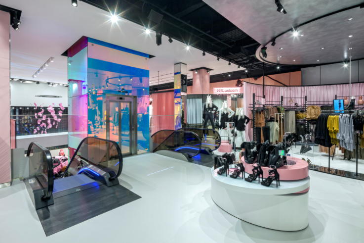
The whole layout is based around this idea of sets and each one can change out really easily. There’s no traditional navigation, so there is no hanging sign saying, denim department, shoe department or even fitting rooms. The whole thing is innovative in that way that it’s laid out completely differently, the whole concept of the customer journey is fresh. Even the fact that we put the fitting rooms at the front of the store on the mezzanine level – that is something that just isn’t ever done. But we felt that actually for that customer it was right that the fitting rooms and social elements were at the heart of the concept.
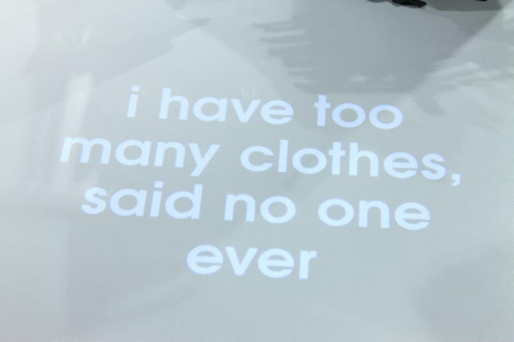
There is the use of projection on the floor as a way of navigation, but also a surprise to customers. As you’re walking through the store, there are little bits of text on the floor which talk to you about either the area that you’re in or share an empowering message. Missguided are really big on empowering women and girls, so the messaging around the store is aspirational, it’s to make you feel good, and that’s something that we don’t see that often in retail anymore. It also stops us from having to do your traditional navigational signage.
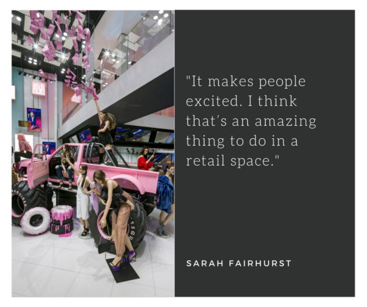
I think that the mannequins are also innovative as they are just like Missguided customers hanging out. They were specially commissioned for the store and it feels like they really took the brand and interpreted it in the way that the mannequins are out together.
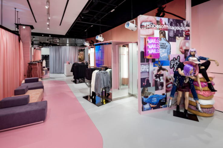
Juan: Being the first physical store, we needed to get it right in creating new concepts with digital, graphics and interiors all merged together to create the full experience. The activation, the spontaneity, the fluidity of engagement, the fun experience of the brand needed to all come together as one.
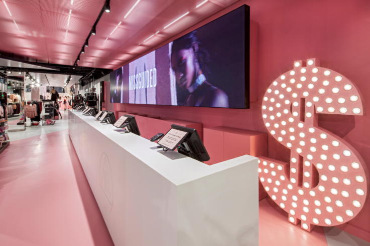
You navigate by the use of props and the mannequins that are set throughout the stores. It’s like its own language, so instead of a sign saying ‘paying here’ you have a gigantic dollar sign. In the fitting rooms and social area, we have vending machine where people can buy ‘Unicorn Dreams’ (water), sit with their friends, try on outfits and have all these services that are there to fully activate the whole experience. The vibe for the fitting room area is a daytime Miami Beach party. There is a projection onto the ceiling of a swimming pool with movement of the water and it’s very relaxing, and along the side of the fitting room there are these big images of palm trees.
Sarah: They also have a WAH nails concession in the store as well. WAH designed a unique range of nail designs for Missguided, so they are at the store regularly for events and at the weekends. So that’s another reason to spend time with the brand.
When it comes to changing how the space looks is this concentrated on digital or are there other elements?
Sarah: We wanted the whole store to have more of a tactile quality to it. There are stretched fabrics, lightboxes and curtains that form the backdrop structure of the sets for all the products and merchandising collections and these can be changed out to reflect a new trend or a new collection that is coming in.
In the same way that Missguided can update their Instagram with new messages every day, the store can also quickly change the tone of voice and language used, so every time you go in ideally it should be something different and new.
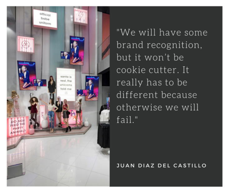
Can you tell me about the ‘on-air social interaction’ side of the store?
Sarah: The on-air concept is the loop from online to in-store and in-store to online. On the left and right hand side as you go into the store, and this is something which is going to be synonymous with the brand I think going forward, is this idea of the deconstructed website coming to life in the store environment. The idea is it is all elements from their website, so campaigns, products and tone of voice feeding directly through a mix of screens, lightboxes and wall hangings.
There are Instagrammable moments like the monster truck, and smaller details like the emojis in the fitting room – we wanted everything to be publishable. So you’re in the space, you’re taking pictures and then you’re publishing it on Instagram or online and therefore connecting the whole journey together.
How do you envisage the average customer journey working between online and offline?
Sarah: Currently people’s only experience with Missguided is online. What is interesting now for them as a brand is attracting new customers that haven’t experienced them online and getting them on-board.
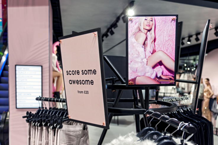
At the start of the journey we have some ‘hero fixtures’, which are 360 degree fixtures and there are some dotted throughout the space as well, and the idea is that the content there is streamed from online and the products on that fixture are representing the content. There are points within the journey where there is integration between the online and offline, so if you have seen something on the web you can go into the store and see it on those fixtures at the store as part of that customer journey.
Juan: The feedback that we have had from the customers is that because it’s the very first store people are travelling from around England, and Europe in fact, to come and see how the experience that they get online is translated into a physical store. That connectivity of what’s digital and what’s physical was a very important point for the brand.
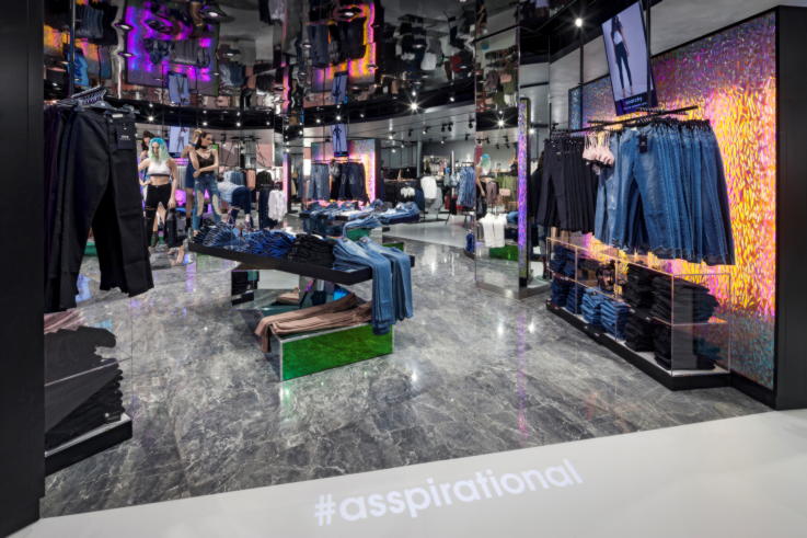
Sarah: We took reference from some of Missguided’s campaigns for the design of the space. For example, a lot of the inspiration for the aesthetic of the denim area is driven from the feeling of those campaigns, so when you’ve got those videos playing in the space the whole thing connects together.
Juan: You get a lot of digital screens that show information on the product, but where this is different is that you have actual models on the screens that rotate so that you get a good idea of the fit of a certain type of jeans. The screens are deliberately quite small in order to create that personal experience. You need to be standing in front of it to get the content, so it feels like it is purposefully for you rather than for the masses.
Was there anything in particular that you learnt from this project?
Juan: I think to be unexpected – that’s what was in the brief, to do things that nobody else is doing, do the opposite of everyone else, embrace the spirit of the brand.
Sarah: And I think to stay true to the brand. It’s taking a brand like Missguided and then hearing them go to the store and say, ‘this is exactly right, this is what our brand is about’ – that’s really rewarding.
Are there other stores planned?
Sarah: There are future stores coming and I would expect them all to be treated in a near flagship experience type of way. I think that’s the type of brand Missguided are and I think that they don’t want to do watered down experiences. When you see customers approaching the store they already have the cameras and their phones out to take pictures. It makes people excited. I think that’s an amazing thing to do in a retail space.
Juan: I think Missguided is all about evolution. It needs to be relevant to today’s market. It needs to be what’s trending right now. Obviously as other stores become live things will progress dramatically. We created an experience in Stratford, the next locations will have a different experience that will resonate with the area that those stores are going to be built in. We will have some brand recognition, but it won’t be cookie cutter. It really has to be different because otherwise we will fail.
Images courtesy of Missguided.

