Green Room – Mike Roberts creates a case for design with a purpose
Never underestimate the important role design plays in the retail experience. Green Room Design is an award-winning consultancy that helps brands create compelling physical spaces that resonate with customers. We talked to Mike Roberts, Chief Creative Officer of Green Room, about the importance of the customer journey and how technology in design doesn’t have to mean screens.
Can I ask what you’re working on at the moment?
A million different things. I recently did a workshop at the Future Stores Europe conference. The underlying theme was how to use digital properly in retail. There are so many really poor examples of digital out there at the moment that don’t enhance the customer experience or help uplift sales. They don’t benefit anybody.
The position we have is to build the customer experience first, map out the emotional journey, and then wherever there’s a touch point find the best media to fill the emotional requirement. Whether that’s a print, a vase of flowers or the way a member of staff talks to you. You want to consider all those things before you default to digital. I think a lot of the time we are quite beguiled, both designers and retailers, by digital – by beacons and augmented reality and touchscreens and things like that. But actually nine times out of ten, they fail to deliver on what customers really need. So it was a workshop around how can you really identify the right time to use a digital tool.
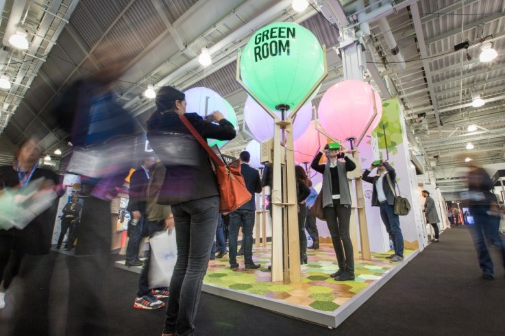
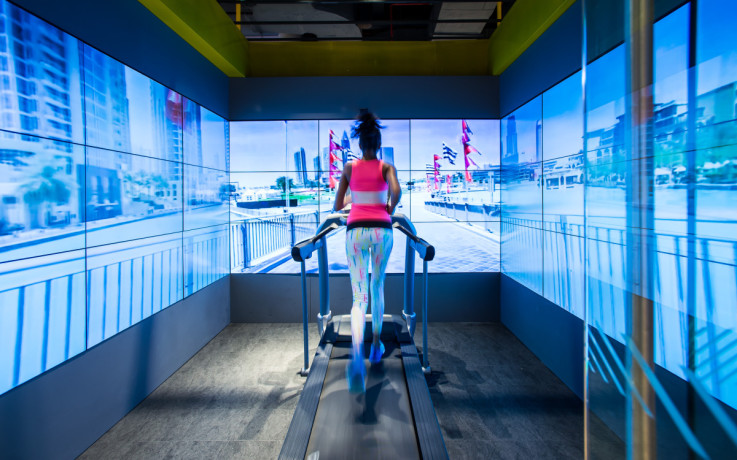
We did a stand at the Retail Design Expo – it was a digitally augmented space, but we had no screens on there. We almost wanted to go anti-screen. We attracted people into the space with these light changing canopies and we mapped native birdsong in the UK at every time of day for the soundtrack. Then we had projection mapping on the floor, which acted as a Hansel and Gretel paper trail that guided you into the space. At trade shows customers have a fear of crossing the boundary because of high pressure sales, so we removed that and were mobbed. We had components which you could touch to provoke a response, and we had Google Cardboard headsets with examples of our projects on.
The idea was that you navigate through emotion and tactility and basic intrigue. That was the customer experience side. The benefit to us was that we were capturing all of that data, and turning it into an analytics platform to really help us understand which of the interactions were working and which ones weren’t. We used data capture cameras to understand if the visitors were male, female, happy, sad. We got that balance of magic and logic in creating a great experience, but with actual valuable, interpretable data that could inform how we manage the space in the future.
So there’s a bit of attention in my mind, if nowhere else, on what the role of the screen in retail is. How do you use it? How do you ensure that when you use it the content on there isn’t just white noise, but has a real deep emotional impact on the customer? It’s a really pertinent question at the moment for a lot of our clients. They might say, ‘I want a bit of digital up there. I want a bit of digital on the back wall.’ They’re treating digital like it is paint or wallpaper. And we’re like, ‘Yes but what does that mean?’ Because it’s not cheap. There’s hardware costs, there’s software development costs, there’s content creation and content management costs. So just saying you want to use digital is very different to actually using it in the best way possible.
We’re starting to create a whole set of tools and mechanics about how to inform that decision criteria. When you start to think about how you map that whole experience out across an entire retail estate there’s more layers of complexity and cost that you need to build in as well. I think that’s where a lot of retailers stumble because they just can’t afford to roll it out without being able to clearly evidence how it’s improving sales uplift.
Which stores are leading the way at the moment in great design, with or without digital
We get asked about who’s doing digital stores really well. The default answer is always Burberry because they have done it really well. But actually that’s a luxury retailer that has invested a hell of a lot of money into their in-store digital platforms. When you strip it down to a more high street accessible retailer it’s very hard to identify anybody, other than our own projects, where you could actually say that digital is working really successfully.
I think there’s a bit of a turning point in the industry from my perspective. When you think about the use of screens in-store they were introduced about ten years ago. Everyone had plasma screens in-store and everyone had plasma screens you could touch with web content on. Not purpose built content. And I think that a lot of retailers have got their fingers burnt.
I think there’s absolutely a future in digital retail. It goes without saying that it will be present. But we’re still trying to find out how to make it effective and how to actually really make sure it has a benefit for both the customer and the retailer. That’s where the issues are.
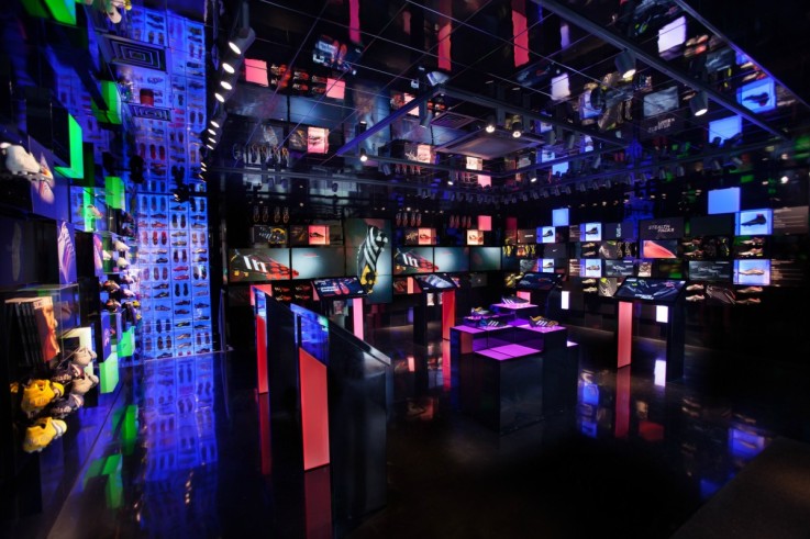
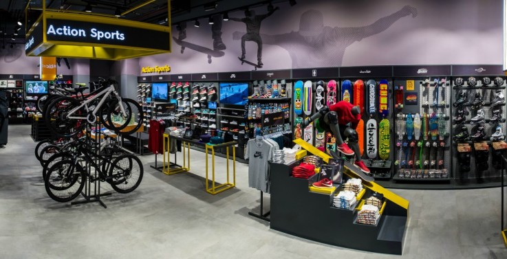
Pro:Direct is a great example of translating an e-commerce proposition into bricks and mortar. And it is successful in terms of translating into sales. But I don’t see joined up digital strategies actually working in retail anywhere really at the moment. Apple do the customer journey really well and they manage payment really well through different uses of digital technology. They manage the whole path to purchase, pre, during and post store visit, really well. They’re more about the customer experience rather than the technical wizardry.
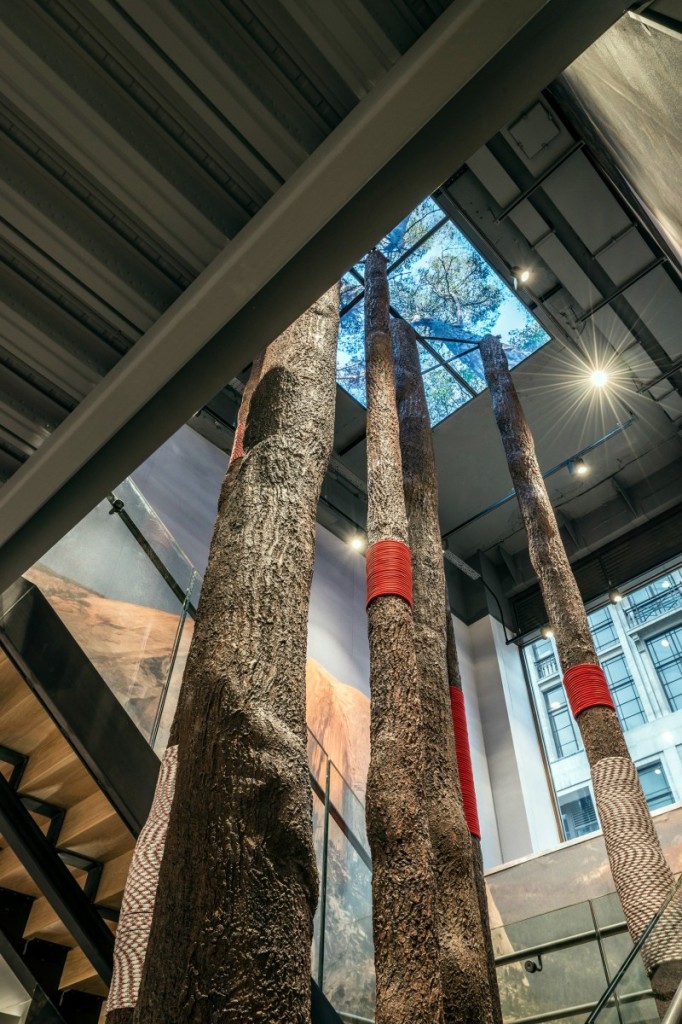
In terms of stores that don’t use digital, I mean you look at examples like Anthropologie where they just have a really, really nice analogue experience. We talk a lot about biophilic design, and how having really good planting in the store shifts the customer mind state, relaxes them, put them into a good state of mind, puts them into a slower pace and encourages them to browse. I think brands like Anthropologie, they don’t throw communication in your face, but they navigate customers around the store through intrigue and emotional narratives.
I think you always have to raise that question as to why would you do that, what’s the point of putting more technology in. I think when you can fulfil a human requirement or an emotional need through something like planting or aroma or great use of tactile materials, it’s a far more engaging experience for the customer than a VR head set. I’m not saying there’s not a time for the use of VR headsets, but it’s to identify when those times are and actually use them for their maximum impact.
Personally I like brands like Urban Outfitters, they create a lovely collation of lifestyle and community and customisation. I think the new store concept for Lush is doing something really interesting in London. It’s bringing in that sense of natural ingredients providence, hand crafted in a really interesting way. There are some really great examples of retail out there. But has anybody created that brilliant platform of bringing the experience that customers are starting to expect online and mapping that against the customers they expect to see in-store? Has that happened? I’m not sure that’s been achieved by too many people yet.
What are the most important retail trends that you think stores should move towards
I think the idea of retailers as destinations is vital. There are very few retailers now where you don’t just have the option to buy something online instead of going into a store. You really have to create something which creates a distinct point of difference. A distinct resonance when that person makes the effort to go into the store. They need a reason to go there. And if you can make that experience something sharable, then all the better.
Mapping the emotional customer journey is really important. The big thing for me now is making in-store experiences meaningful for both the customer and the brand. A lot of the brands we’ve worked for have got set procedures or set ways of doing things. They have their telecoms team in the building one side of town. They’ll have their retail team in a building the other side of town. Their service is decentralised. Customers don’t see that, customers just want a great interaction with the brand whichever channel they’re using. It’s industry standard to say “take a consumer centric approach”. But I don’t really believe that’s happening that often. I think it’s just a buzzword rather then something that people really stand by.
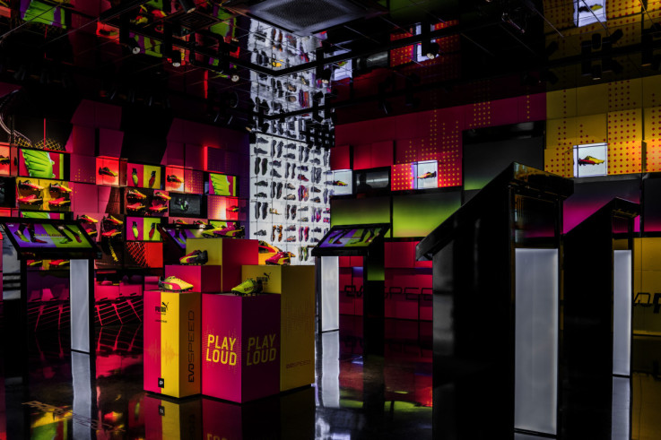
With Pro:Direct, the intent was not only an embodiment of the brand in a physical environment, but also a launchpad for brand understanding and brand loyalty. People that hadn’t been exposed to Pro:Direct as a brand suddenly become advocates from having a great experience. We wanted to give them the ability to share that experience.
We’ve just opened a North Face store in Stanford Mall in California. The sense of community for a brand like North Face, it works on both a global and a local level. We put areas in there that resonated with the local community like a hub for local running clubs. When the store opened there was a whole series of events where athletes would guide a bus to the local mountain ranges and give climbing lessons.
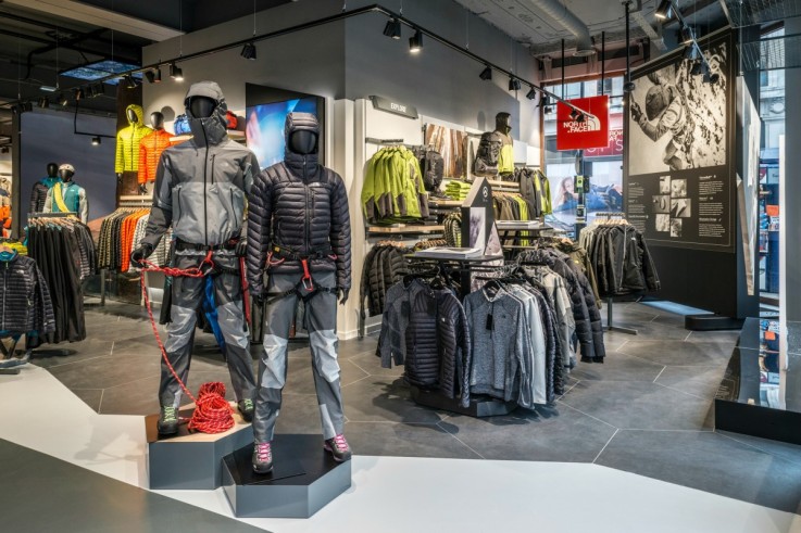
Community on a local level is important. But also for many brands, and North Face being one, their sense of global community is important as well. How can you start to bring stories to life from the Himalayas to a store in Stanford Mall? And how can you make that relevant? We were really involved with the repositioning of the North Face as a brand as well as. A couple of years ago the brand would really speak to extreme athletes, and it inspired a lot of people. A lot of people wore the brand because they want to be perceived as being an extreme athlete even though they barely got off their sofa. There were those points of connection. Those “I can do that too” moments. We were involved with actually identifying different types of consumer audience that wasn’t about demographic, but about attitude. And then creating a whole set of experiences, touch points, communications around them.
When you talk about community, it’s actually understanding what community really means. A lot of retailers just think it’s ‘put a pin wall by the changing room’ and that’s that box ticked. It’s a little bit like their opinion to CSR or charity. As long as you’ve put a poster by the counter saying that we donate money, that’s it, it’s done. They can’t do that. It can’t just be tokenism. If you really want to resonate with community or if you really want your CSR to have impact, then you have to do it in a way which is transparent and truthful.
Back in the ’90s and early 2000’s everything was about expressions of power of the brand and how great the brand was. Brands are becoming a lot more humble now. They actually want to have meaningful dialogue or facilitate dialogue, rather than just broadcasting monologue. I think it’s important to do that. You get brands like Lululemon that do it really well. They’re still a retailer, they still got to make money. But they find a really nice way of having that resonance with their target audience.
It’s really trying to understand what the customer wants and not tell them what they can have. One thing I really preach about is it’s not showing a customer what they can have by asking them what they want. And that shift is really important.
What are the key steps that you would take a retailer through to revitalise their spaces?
We went through this process with a client of ours recently. They were losing market share to craft producers and independent stores. So they created a new concept which involved consumers in the customisation of their food, but it wasn’t working in the way that they wanted it to.
After taking the brief, the first thing we did was to sit in the restaurant and watch consumers, watch the way they interacted with the technology, the way they then found where they wanted to sit, and how they behaved in the interim period before the food was delivered. We backed up our in situ observations with desk based research into what the customer profile looks like? What’s the brand awareness and brand health? And what are the barriers – even to down to what’s preventing them from entering the restaurant?
We then mapped the emotional journey and we mapped it almost like it was a chart where you would have highs and lows, great expectations and then obvious disappointments. This clearly identified where the pressure points were for the identified target. We then looked at how we could improve key points along that path. How we could build a narrative that supports and moves that journey along? How we could create a great experience for the customer and from that came the key pillars we could design around. In short, it’s understanding human behaviour, or human desire, or the human reasoning behind why to enter an environment. What are they hoping to get out of it? How can we surprise and delight them along their journey?
How do you see these experiential stores reconciling with the amount of time customers have to shop?
We’re doing work with some automotive brands at the moment. One is a leading automotive brand who are creating pop-up experiences in malls up and down the land. We know there’s been a big shift in the way people buy cars. I think the frequency of visits to the dealership prior to making a decision to buy have dropped from five times to 1.5 times. Customers are actually doing a lot of their pre-purchase consideration through other channels, through the internet or driving a friend’s car. That’s how Argos became the biggest seller of iPads a few years ago. Nobody needed to try an iPad because all their friends had got one. All they wanted to do was get it.
So time is finite but also consideration is different to how it used to be as well. For this brand they’ve addressed the issue by actually going to where they believe their customers are and then creating an experience, which they think will resonate with those customers. Something that will add a bit of fun, will give them something to talk about. But they’ll also see the idea of buying a new car and buying it from this automotive brand.
Another automotive brand we’re talking to are doing something similar, but they’re not treating it as a pop-up. It’s an opportunity to introduce people to a brand and help them realise that a car isn’t so expensive. When we look at our communication structures in-store, we’re trying to persuade our clients to say very little to customers but just to say it really well. If you’ve got a POS don’t try to explain absolutely every technical benefit of a product. Just tell them why they might like it. Or just let them pick it up and play with it.
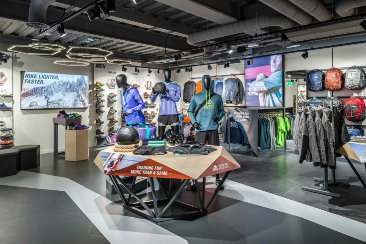
It’s identifying where your consumers want to see you and then creating an experience that is aligned to what they want in that environment. Whether it’s a pop-up in a mall or an activation at a Goodwood festival, or even a big old car dealership out of town.
I think a lot of brands have to align themselves to the customer more than ever. That whole mentality of build it and they will come with out of town retail parks and dealerships isn’t as relevant as it used to be, because customers can now decide to shop how they want to. Rather than the retailers dictating behaviour, it seems that the balance of power is shifting and that actually customers are starting to demand that retailers provide the services. Brands can’t just embark on a two year programme of retail to get to the end result, because by the time they’ve got there customer behaviours will have changed.
Some of these ideas have been around since the ‘60s. Why are companies still trying to tackle them?
A lot of businesses have grown around trying to make their processes better, trying to eke a bit more margin wherever they can. Normally it’s in one way or another to the detriment of the customer. They may say that actually it makes the end product cheaper for the customer. But that’s not really what most customers want in most instances. They just want to believe in something.
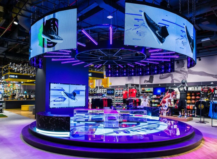
The same things apply to commodity items as much as they do to experiential items. Aldi and Lidl are great examples. They’re value retailers but there’s still a great sense of experience when you go in there. There’s still work to do in getting the balance between great customer experience and effectiveness of the brand. Effectiveness can come in profit, but it can also come in building brand loyalty, building brand health, building brand perception. There’s lots of different ways of cutting it.
There’s this idea that companies should be silo-less, but how do you deal with that at scale? As a big company or business?
As a consultancy we’ve grown quite rapidly. There are obviously inherent growing pains when you do that. But we’re actually looking at ways of creating teams within teams. We are starting to think about how can we build back into our platform with a team mentality that enables people to align to a vision.
I suppose it’s about how solid the boundaries of those ‘silos’ are. When I first started the Green Room five years ago, there were some very distinct silos between departments, between creative, between developments, between productions. But we broke the boundaries down so that the process was more fluid. I think people still want to feel a sense of belonging but there’s also a sense of being able to migrate or help out when the need arises.
We do a lot of our own R&D and tech research, so we’ve got an imaginarium and then we have rooms where we’re working on pitches. We’re actually creating flexibility in the environment that allows for these teams to be constructed, whether that’s for a two week period or a four month period.
I suppose it comes back to how we manage people. I think natural instinct is to silo quite quickly, and we want to make sure that there’s still that sense of identity within the team, but with the fluidity to move people around. The real risk of siloing that you just become formulaic.
Do have any predictions about what the UK’s most innovative retailers will be offering in 2020?
We’re doing a lot of test and learn on various different levels now. For the TNF Global project we did an extensive pre-opening test and learn programme to ensure that the interactions we had in the space resonated with the right audience prior to launch. So then there’s a fairly good chance that the store will work prior to even launching. However that’s quite an extensive process. It will draw out the time from project briefing to store opening.
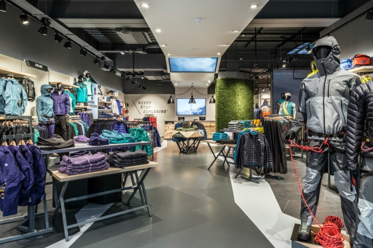
One recent example comes to mind. A client asked ourselves and another agency to both, simultaneously come up with creative schemes. The client selected their favourite design aspects from both approaches and applied them to their space in New York within a matter of two weeks. They observed how customers behaved and whether profits went up. Then they took what was successful and rolled it out, and scrapped what was unsuccessful. So you’ve got one approach which is very conservative and one which you could almost say is renegade or maverick. They both worked, but on different levels. I think they both also importantly embrace failure. It’s how they manage that failure and what they do with it that’s really important.
In the past you’d do a big eight month piece of work on a concept for a flagship store for a brand. You’d see it through to opening, you’d hand the keys over to the client and they’d say, “see you in five years when it’s time to refresh.” We can’t behave like that. I think the relationship between consultant and client needs to be active on a more regular basis. With clients like the North Face we talk to them almost weekly. We heavily engage in their retail programme. It’s not just about agility but empathy, a real understanding of what the tensions are on their brands and their customers on an on-going basis.
Retailers are also identifying different types of formats, different types of opportunity. Looking at smaller format retail with endless aisle opportunities or diversifying to become a destination. Big brands and retailers are now actually starting to embrace that pop-up agile mentality, to make sure that they engage their customers even if it’s only to drive brand awareness or to engage a new audience.
With a lot of our clients we talk to them about “it’s not about the product it’s about the benefit.” Their customers are humans and their needs aren’t singular. They overlap in many different ways and a brand that truly understands and empathises with its customers will get it right. Ones that don’t or ones that just keep wanting to sell more stuff will fail.
Want to quickly and easily connect with the players kick-starting trends and inventing the future of retail? Find out how you can transform your team’s thinking using Insider Trends’ little black book here.


