Love it or hate it you can’t ignore it: Dalziel & Pow on designing a high street presence for Missguided
With headlines dominated by retail store closures, you might think that any successful online brand will be breathing a sigh of relief regarding their own business strategy. And yet Missguided is one of many brands that is translating its online success to the high street and providing a much-needed breath of ‘retail’ fresh air in the process.
Together with design agency Dalziel & Pow (D&P), Missguided has not only successfully translated its online aesthetic and brand power into its Stratford flagship, but further offline spaces as well. In the process it’s inspired the retail world to do things differently.
Sarah Fairhurst, design director of Dalziel & Pow, takes us back to the start of the Stratford project to talk approaching designing an offline store for an online brand, ripping up the retail rule book and the value of divisive design to inspire.
Could you tell us about the process of designing the store?
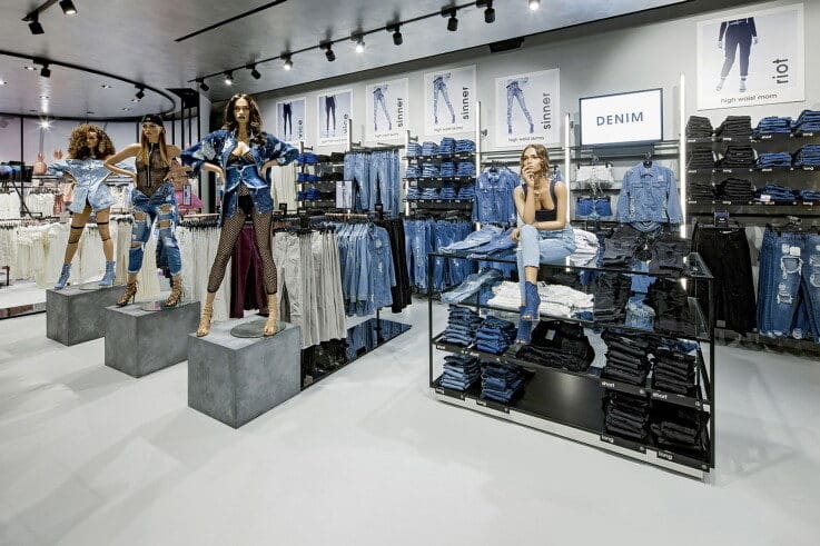
One of the reasons that Missguided is such a strong store concept is because the brand has such a defined purpose and personality. What was exciting for us is that Missguided came to D&P as an online brand with no physical store presence, traditionally a lot of our clients already have that high street presence, but for Missguided not having any legacy practices meant completely starting from the beginning. Going up to Manchester and meeting Nitin, who is obviously a huge part of the Missguided brand, and then having immersion with their brand teams and head offices really informed the way we then felt about the brand and how we interpreted it into the store.
Where did the key themes for the store come from?
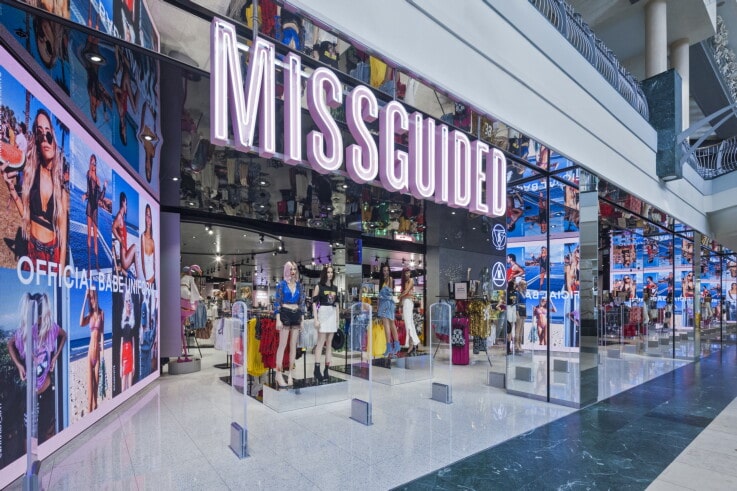
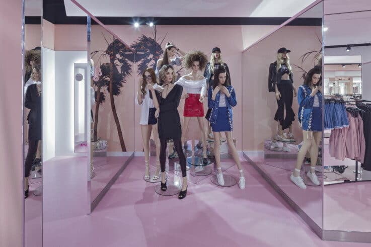
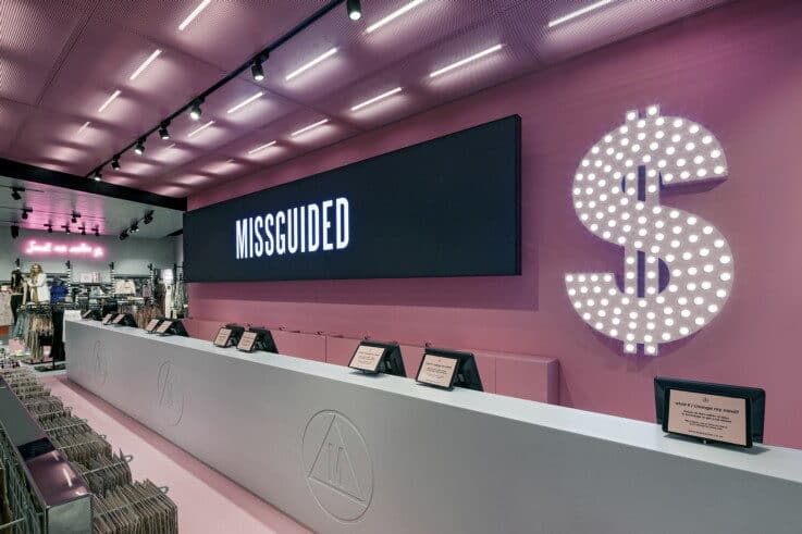
Because Missguided didn’t have any high street presence at all everything could be challenged. I think that really represents them as a brand – that idea of rulebreaker, wanting to do things first and do things differently. Part of their brief was that they didn’t want to look like everyone else on the high street, they wanted to do something that’s different. That really gave us permission to rewrite the rules. The more we thought about the Missguided customer the more it helped us to come up with these concepts for the store. We understood the customer to be very extrovert, very confident, broadcasting their whole life online and so things like putting the fitting rooms upstairs at the front of the store visible to everyone in the mall felt like a direct response to their type of customer.
The experience vision for the flagship concept was ‘on air’ and it was all about broadcast and creating a space that can be shared outwards beyond the store. A lot of traditional retailers are trying to understand how to connect the journey and bring things online from the store. With Missguided it was more about creating a space that broadcasted content all the time and allowed their customers to come in, take photos, and be part of that connection.
As the brand is bold and brave, we created the idea of ‘the extrovert on the high street’ for the shop front. It was about opening it up, making it as loud as possible and making sure it got noticed. One thing that Missguided lives and breathes is standing out from the crowd. The screens in the entrance space are to connect the website and social media directly into the store. We called it a deconstructed website and the idea was to showcase the content and TOV directly from the website/Instagram and spread it across the entrance space as an attractor. It feels like you’re walking through their website.
People are also really important as well. The aim for Missguided was that it employed people that felt very on-brand so we created a space in the back of house that felt as special as the store itself. I think it’s really important that the people who work in the store feel empowered and part of the brand. We incorporated a makeup area where they can get ready and then above the door as they enter the shop floor there’s an ‘On Air’ sign flashing. The idea is that they feel like they’re about to go on stage, clearly demonstrating how the brand personality is translated across all the different touchpoints.
What differentiates this from other projects?
I think it’s the customer journey, we really tried to represent how the target audience shop today. For example, people don’t go on the home page of a website and go through a traditional linear journey. They shop through Instagram or through the 56th page of a website because they’ve linked through from somewhere else and we wanted to try and represent that way of shopping in the store.
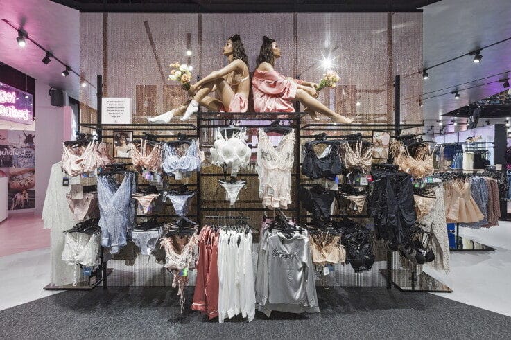
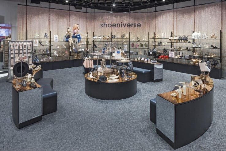
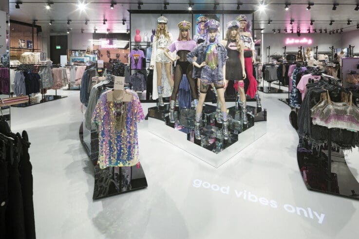
We completely ripped up the traditional customer journey. We avoided having any standard departments, so you don’t walk in and see the denim area or the formalwear area. It’s a journey of discovery. We created ‘sets’ where any product could land anywhere for customers to discover it. These areas of strong personality could change from lingerie to formalwear depending on what collections are dropping at any time. Also, you’ll see there’s no standard product navigation. It’s all created through the use of GOBOs, so that it can be changed instantly. If a collection changes out then they don’t have to take down a sign. It can be changed quickly to allow that more fast-paced, very flexible, animated, loose journey.
How often does the design of the store entrance change?
Fashion retailers would normally work seasonally whereas Missguided is less about your traditional spring, summer, autumn, winter. It reacts to relevant and topical things that are happening. For example, Love Island was a huge campaign for them, so they adapted the space to capitalise on that and feed off the hype. As soon as it’s finished the store will transform over night for the next launch/drop or campaign. I think it’s quite interesting and exciting that new fashion retail is no longer tied so much to seasons.
What was the approach to screens in the store?
The Missguided customer is obsessed with their phone anyway, so it makes more sense to connect with them through that, rather than putting touchscreens in-store. Touchscreens also tend to not work or can be quite clunky and slow.
The Missguided concept encourages the customer to use their phone to take pictures and share, rather than install Facebook mirror or something. Our impression of that type of technology is generally quite gimmicky and actually your phone performs that function / end result in a much better and controlled way. There aren’t too many screens in-store other than the deconstructed website concept at the front of the store and some hero fixtures throughout the store, 360-degree circular ones, that have campaign content on them. It was more about linking to Instagram and publishing rather than touchscreens.
Are there any other stores that you think use tech really well?
In terms of a seamless experience Zara in Stratford is amazing, it’s a best in class example of how to transform the customer experience and integrate online and in-store shopping. One example is that you can go in the fitting rooms, try on your products then you don’t have to come back out and queue at a cash desk to buy, you can pay at the self-service check-outs next to the fitting rooms. The store has a real focus on service, convenience and a streamlined shopping experience.
What have been the results from the project?
It’s worth noting the impact it’s had on other retailers – we work with lots of different retailers across the world and the amount of people that reference the concept is incredible. Missguided’s ambition was to shake up the high street and they have done this whole-heartedly.
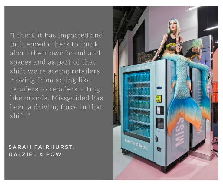
It’s not unanimously liked by everyone. I think it’s a bit of a Marmite type of thing – you love it or you hate it, but you don’t ignore it. That’s what they really wanted. I think it has impacted and influenced others to think about their own brand and spaces and as part of that shift we’re seeing retailers moving from acting like retailers to retailers acting like brands. Missguided has been a driving force in that shift.
When we see boring retail – it’s usually because they are trying to please everyone. In some ways it’s good that some people go into Missguided and they feel uncomfortable because it’s not for them. I think they’re very true to their brand and their audience in creating a world truly for them.
It’s also prompted new thinking about the store as a stage as it’s dressed that way through innovative and immersive VM. When Missguided launched Babe Power perfume it became the number one perfume in the whole of the UK, which is really incredible. I think that the store acts as a stage for things like that – it wasn’t just a perfume on the cash desk as you leave, it was a whole shop takeover. The Barbie collaboration featured super-sized Barbie boxes in the entrance space for people to climb in the packaging and take that all important selfie! Again, they are always looking for and owning the perfect opportunities for the customer to broadcast.
The store has also won multiple awards, including a World Retail Award – it really has disrupted the industry in a good way!
Are they planning more stores?
Missguided as a brand never stand still. I believe it will always have a presence on the high street, but I see there being a mix of formats and uses for their spaces, smaller spaces, pop-ups, event spaces that deliver on experience. Their website is massively popular, the brand is ever evolving, they move quickly, they are agile and their physical spaces need to respond to this, playing a slightly different role in the future in the UK.
The other thing is that they’re looking at expanding into the Middle East, partnering with AZADEA Group, launching smaller branded spaces at quite high volume. That’s a different interpretation of the brand and a different evolution for a very different type of market. Something that we’re working on currently is how Missguided communicate that they are from the UK and how do they tell that story in a Missguided way.
What do you think about the relationship between Instagram and design?
I think what happens is that everything gets a bit blurred, but then when something comes along that’s totally differently it has that power to stand out. I would probably tie all of that back to having a very strong brand and purpose and sticking to your values and being clear about who you are. It stops it from being an aesthetic exercise and it make it more about something much bolder. If everything starts blurring you have to work harder to stand out and have a much more defined reason for being.
Gentle Monster is my go-to right now for doing something different and changing people’s perceptions of what it means to be a shop. Its stores in the Far East (and now in London also) are just incredible. Each one is entirely different, but it’s so them. I think the lack of product in their stores but the amount of experience and the balance of that is really interesting.
Stylenanda Pink Hotel in Myeongdong, Seoul is themed around a hotel but it doesn’t feel too themey or tacky, it’s the perfect example of a space to share. When you go in there’s a cute concierge desk with hotel keys hung on the wall that give you access to fitting rooms around the store. All the floors have a different purpose, the Pink Pool Cafe is located on the 5th floor and inspired by a swimming pool and on the roof there is a dedicated chill out space. You want to Instagram all of it – aesthetically it’s super strong and really visual. It feels like they’ve bought into a strong concept and then delivered that through every touchpoint and every detail. It’s really fun, memorable and you can’t help but leave smiling.
Would you do anything differently if you were to approach the Missguided store again?
With Stratford we inherited some of the architecture, so we had to keep the lift and escalators where they were and I think if you did have a completely fresh start you would plan it differently. In terms of the brand and the way it is interpreted in the space I think it is a strong representation of who they are. Brand and impact wise it’s delivered on what we wanted it to.
Images courtesy of Dalziel & Pow

