One size does not fit all: how Design4Retail’s holistic approach is changing store design
Creating an engaging retail store is a difficult business. But retail design agency Design4Retail has a solid track record when it comes to ideas that succeed. Its holistic approach means it can work with retailers from initial brainstorming to final installation.
It’s an approach that’s paid off for brands from Adidas to Toms to Lacoste to Too Faced. We spoke to Design4Retail’s Brittany Reid to find out how, covering the company’s recent repositioning, the role of tech in stores and making ideas possible:
Dream Houzz
What makes Design4Retail different?
We’ve just repositioned ourselves as an agency. Our name is the same, as is our ethos, but we wanted to really look at what we were offering to clients and how it made us stand out.
We can offer a little bit of everything from branding all the way through to installation, so our new tagline phrase is ‘ideas made possible’. We do work a lot on trends and insights. The future of wellness in retail is a big focus for us as I think it touches so many different points.
We didn’t want to become the agency that talks about one thing like experience or technology. We appreciate and love working on those things, but we wanted to highlight that we want to focus on all of it and discuss all those options with our clients.
Too Faced
Can you talk us through some of your recent projects?
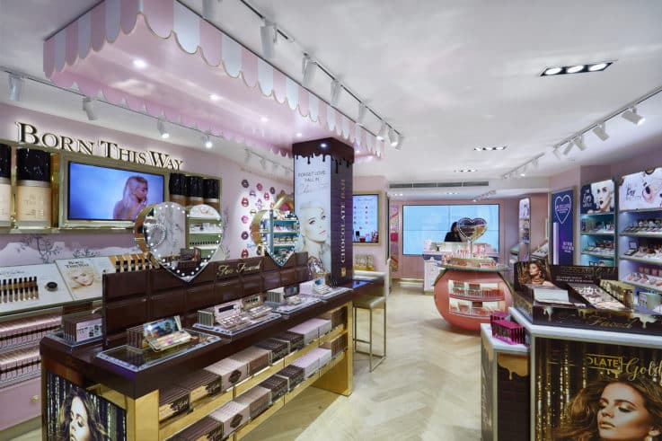
One was working with Too Faced on their global retail identity. We started with the smaller concession spaces in Debenhams and Selfridges predominately, and then went abroad to places like Russia.
The Carnaby Street store was pivotal though as it was their first full store format. At the time it broke all records for a Carnaby Street store opening, which was wonderful feedback for us. It was great to see people enjoying spending time in the store and interacting with the brand, because a lot of these fans had ordered online previously and wanted to see it in person.
Dream Houzz
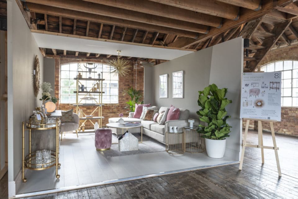
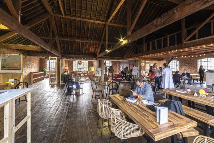
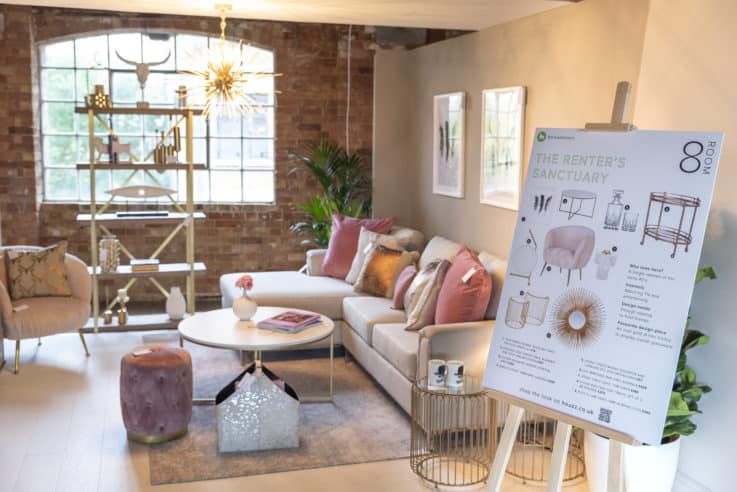
Another was with Houzz, the online platform for furniture and interior design. They’d previously done a shoppable pop-up in a townhouse and they wanted to do something similar to get first-hand experience with their customers and consumers.
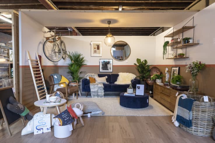
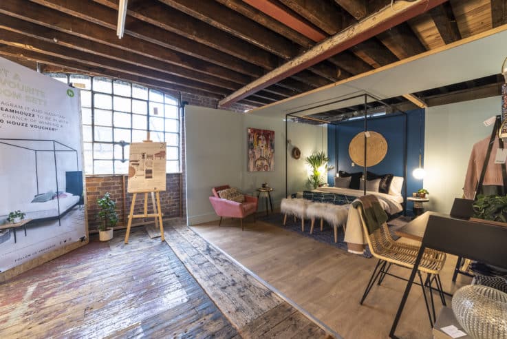
We went through a few ideas and ended up with the Dream Houzz, which was set in an abandoned warehouse for 10 days. They worked with eight or nine interior designers who each had their own room sets to design, such as the apartment flat share and growing family.
All of the items were shoppable on Houzz online and there were touchpoints throughout to allow people to do that or create a wishlist to take home. Everything was shoppable, even the coffee shop. They were incredibly pleased with the feedback they had from customers going in and the interior designers as well.
The Sports Edit
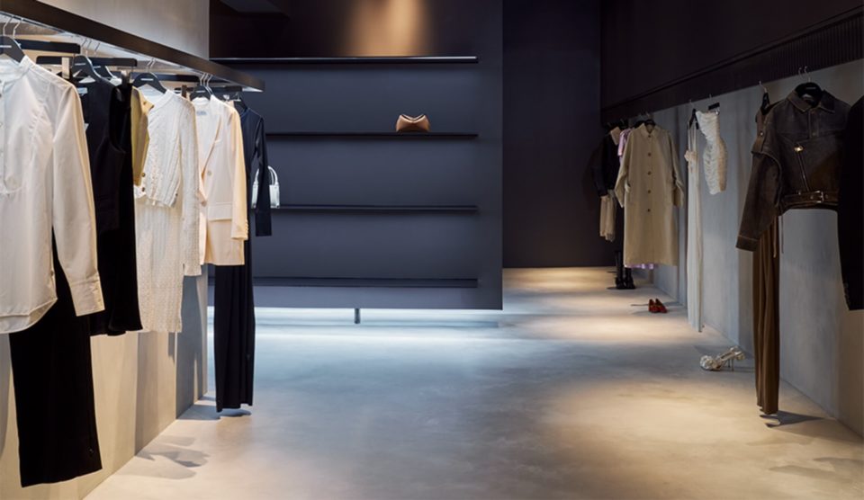
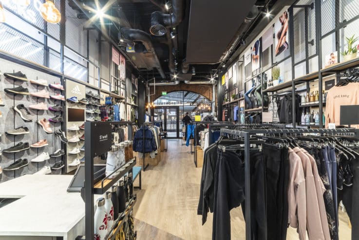
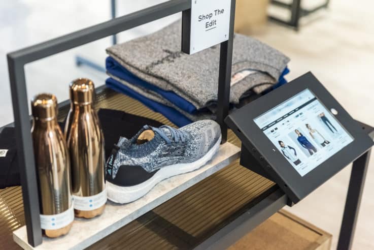
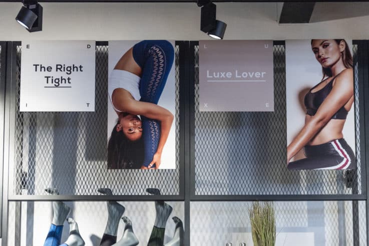
Most recent was The Sports Edit at Coal Drops Yard in London. They’re a multi-brand supplier and wanted to focus on people’s personal goals and personal empowerment. We devised a palette and full retail identity that would focus on that.
When you go into the store it is differentiated into men’s and women’s but rather than being divided into different sports, it’s determined by the person eg the yogi, the cardio junkie, the master of athleisure. People felt they were shopping for their own personal needs.
Too Faced
Can you tell us a bit more about what was involved in the Too Faced project?
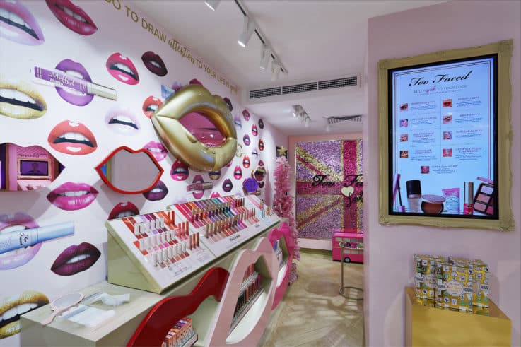
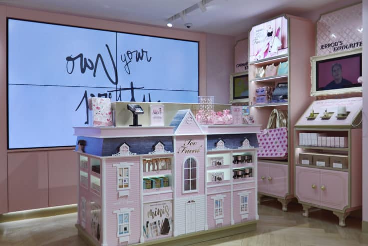
It was everything from the ground up. When we started the conversation, they sent over a very well put together document with their brand personality and what they wanted to put forward to their consumers. It was then about transforming that into a retail palette that would work really well for everything from a full store to a concession. We even custom built all of the furniture and bespoke elements for the spaces such as the big chocolate bar palette and giant foundation bottles.
Too Faced
Why do you think the Too Faced space was so successful?
I think for the Too Faced consumer it’s that essence of being incredibly playful with product. It’s not just a case of buying a mascara that’s going to lengthen your eyelashes or make them thicker; you buy it because there’s a bit of a quirk to buying something called Better Than Sex mascara. You’re taking part in a big Too Faced story, which is something playful and imaginative.
I think transforming that into a store was really exciting for us and the brand. When you walk in you there’s a giant mascara and chocolate bar palette to shop from, combined with areas like the dolls house being the cash desk and the sequin wall being a place for a selfie. It’s all bespoke and quirky just like Too Faced are.
People are going in because they love the product and the product sells really well, but they’re also going in because it’s fun. It sounds like a really basic thing, but I think that’s where the success comes from.
It isn’t just ‘come in, try some make-up, have a makeover’ –it’s come in and see these giant foundation bottles that are really cool and see Jerrod’s favourites so you really feel like you’re getting one of the Too Faced founders’ favourite products. People enjoy it from an experiential point of view, even if they just want to take a picture and leave again.
Dream Houzz
Do you feel that 10 days was the perfect length for the Houzz project, or would you have extended the run knowing what you do now?
I think 10 days was the perfect amount of time for the interior designers and Houzz to connect with their visitors who might be going just because they love interior design. Ten days is a bit like going to one of the design weeks; you’re not going to return to see the same interior design multiple times.
I don’t think I would have extended the run, but I think that doing them a few times a year in different locations would be a perfect fit for the brand. Perhaps even something with designing spaces inside different houses in an area.
Dream Houzz
How do the costs of setting up a pop-up space compare to a permanent store?
In terms of the cost for insight and design, it tends to be the same whether it’s something for 10 days or permanently because a lot of design time and work goes into the scope.
The thing that really differs, and is rarely discussed in this context, is that the brand will be choosing between a short-term lease or a long-term lease. Those tend to be the biggest cost changes.
The Sports Edit
What is your process when it comes to deciding what tech to use in stores?
It is entirely bespoke per project. It does often depend on budgets, but if it’s just for the sake of having technology in there we won’t put it forward. That’s always been one of our mottos.
We find now that a lot of briefs will come forward from brands, whether traditional or new, which will say ‘include digital’ or ‘include technology’. They often won’t say any more than that. I think there’s been a big revelation that digital is the future, so a lot of brands are hoping to keep up.
If we feel like technology will work really well like with the Houzz pop-up, because it’s shoppable or utilises beautiful content, then great. The McDonald’s screens will always be used as they are there to serve a function.
A lot of the time though we do push back. There is no one size fits all for stores. We find that when you go to look at stores to see how they are shopped, you find a lot of those screens are not on, being used or being looked at. We do make the point that if it’s not there for a reason we’d rather spend no budget on it and utilise the money on something else that would resonate better. We are really hot and heavy on making sure we discuss it for its viability and purpose.
For example, The Sports Edit wanted to set up a space that is an edit for the customer. They’d rather someone come in and interact with that, than go to a screen and filter by ‘yoga’ because that’s what they can do at home. They’ve come to the store for another reason.
The Sports Edit
Is there a dream client or project you’d like to work on?
We always have a few. As part of our internal discussions we often say, ‘if you could work with anyone who would it be?’ One of the ones at the moment is Glossier. From my perspective I love their products, but they’re also an exciting and beautiful brand to look at.
They do a lot of pop-ups at the moment, but I think when it comes to permanent stores it’s the same challenges as a lot of brands – how would you make this an exciting space? If you don’t go in and think ‘this is a really cool space’ would you want to keep going back or just order online and have it delivered and return what you don’t want? We start a lot of briefs with thinking about why you would want to go to the store and that would be a big part of us looking at a brand like them as well.
Images courtesy of Design4Retail
Design4Retail are one of our top 50 retail design agencies. Find out who the other 49 are here. Or visit fantastically designed spaces on an Insider Trends retail safari.

