Stop fighting progress: Sergio Mannino on why stores need to stop seeing the internet as the enemy
Prada, Jessica Simpson, Lexus, Miu Miu – it’s a varied client list, but one that perfectly fits Sergio Mannino Studio’s approach. In founder Sergio Mannino’s own words – ‘a successful design is greater than the sum of its parts’.
The New York-based multidisciplinary design firm creates retail spaces, interiors, and even furniture. With more than 250 projects completed throughout the world, the company knows a thing or two about what makes for a good retail experience. We sat down with Mannino to find out how changes in retail impact design, why curation is necessary and why the stores and internet aren’t at war:
What kind of clients are you working with?
We work with all kinds of clients. We don’t specifically specialise in high-end, actually we also do a lot of start-ups and small clients with tiny budgets, which are also very interesting.
There is so much going on in retail right now. The shift is massive. It started 15 years ago, but I think that now you can finally see the results of the internet. I also hear a lot of people blaming the internet for stealing their business, like they are two different channels – ‘clients don’t come to my store anymore because they shop online.’
But the reality is that retailers should broadcast their marketing through all the channels at the same time. There is no competition between internet and stores, it’s all one thing. It used to be that you decide that you want to buy a TV, so you go to a store, you ask the staff to suggest the model and you take it home. That doesn’t exist anymore. From the moment you walk into the store you know more than them. You’ve already done your research, you know what you’re looking for and then from there eventually you might end up in the store. You can look at it and maybe you’re not even going to buy it there, but you may go home and buy it online. All this has to be integrated into the retail experience.
Is this how you see the store of the future going?
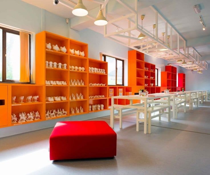
I’m sure in five years you’re not going to go to the grocery store to buy paper towels, shampoo etc. You’re going to get it all online. You take those daily essentials out and what remains is the real reason that you go to a store – experience. We did a project called Bubble Splat, which is the quintessential example of that. It’s a place where kids go and they have a blast, they paint, they make things, they enjoy their time. Then the parents come and buy something from the cafe when they wait for their kids.
There are two floors; on the top floor you have kids parties. The room can be divided based on the size of the party. On the lower floor there are these big tables where kids can buy a white ceramic ‘biscuit’ and paint it. They can make soap and all sorts of things.
Are there any other interesting projects you’ve worked on?
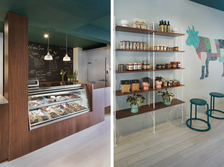
We did a butchers shop for a client that owns a farm in upstate New York, so everything is local, organic. They sell meat and cheese, but the idea is they control everything they sell. Most people now want to know exactly where their meat came from, did it travel around the world to be processed etc. People don’t want to eat that anymore if they can afford it. They want to see exactly where the food comes from. The client built a database of all their animals, so when you buy a piece of meat it will have a number you can look up online and it will trace everything about that animal, what it ate, what shots it got etc.
This is a very interesting new approach because it’s transparency and it could be implemented anywhere else. If I’m buying a ceramic, I want to know how it is made, what materials are in there, who made it, how much did they get paid for it. Every product can have a label with a code where you can look up the history of it. This is what people are looking for now and it’s a great example of how all these channels can work together.
There are so many things you can do as long as you stop fighting the internet and its prices. Because that’s what people have been doing for years – ‘oh it’s cheaper on the internet so I lower my prices’. Then it gets even cheaper on the internet and then you’re lowering your prices to the point where you can’t pay your rent.
If you have a store that sells unique products, you’re not competing with a thousand other retailers who are selling on eBay or Amazon, then you set your prices. In the store you can offer all the information and experiences so that people can go there and touch it. In reality going to a store is fun.
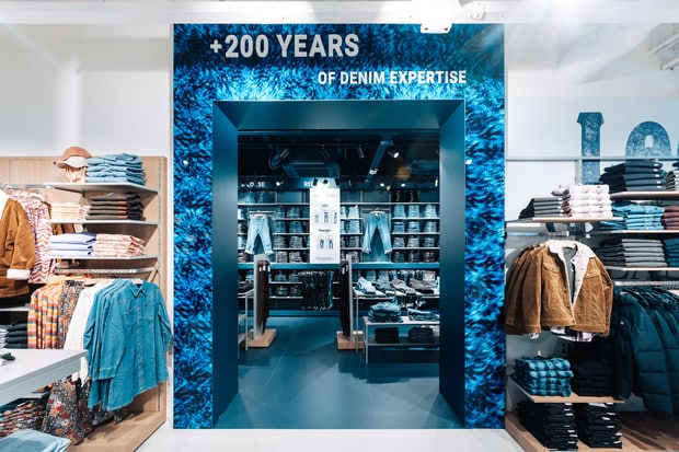
Buying online is ok if you’re buying toilet paper, but if you’re buying a jacket or a table or chair you want to see it. I don’t think that has changed. What has to change is that the moment you enter a space the store has to be amazing. It can’t just be metal racks with thousands of products on them. That’s what the high-end stores understand. You have to feel like you are in a special place immediately – all the senses, smell, touch, visuals – everything has to be an amazing experience. And you can’t beat that with an app.
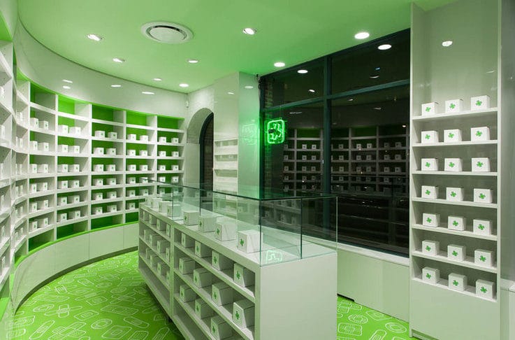
On that note, we’ve also built a series of pharmacies for a client that has an app. You can get your prescriptions delivered to your house directly from the app, but you can also shop in the store and talk to the pharmacist. You’re not losing your client because they’re going to an app. You know there is a physical place where they can come back and find you because there is a real person behind that app.
The space is mostly in the back where the operational side is. So around 20% is open to the public, but it’s very cool design with some basic products available. It’s the face of the whole operation.
If mainstream stores move that way, what will high-end stores need to do to come across as different?
Selecting the right product. You don’t want to go in a store and see 500 different speakers because you will get lost. You want to be told this speaker is better if you listen to rap, or this one if you like classical and so on. And then there might be three different prices ranges and that’s it. Then you want to listen to it in the best possible way.
If you go into a store with hundreds of options at that point you prefer to go online as you’re overwhelmed. I think that brands have to lower their products – Apple has done that really well. They don’t sell hundreds of products and when you enter you know exactly what you want.
I think retailers also need to look more widely for inspiration. If you’re only looking at your own field, you are copying people that have done something already. You become a follower, not a trendsetter. A lot of people follow Apple all the time, but they shouldn’t be. They’re not necessarily doing it right. Try something that has never been done before – if it works you will be the first one and everyone will try and copy you. That’s where you want to be.
When designing stores do you think about social media and the sharing culture?
That’s something we’re exploring right now ourselves. You find images on websites, but you can see the same images on Instagram and other channels, so the website should be different. It should explain the project as a case study where you can learn. That’s a shift a lot of other stores could do – tell me more about what you’re selling, where you’re making it, how you’re making it. Who made the jacket? Share pictures of the factories and the people who work there. That’s what people want to know.
You’re not only selling a product, you’re actually educating the customer and the customer comes back to learn something else. Then maybe they’ll be curious and they buy another product. Maybe you become the expert for that area. It’s not about selling one piece, it has to be much more than that. It doesn’t matter where you’re buying and how you’re buying. All these elements have to play together.
What are your thoughts on the retail experience of the future?
It needs to be specific for your brand. Just having a concrete floor and two racks won’t do it anymore. You don’t have to spend millions. It’s about how you do it. People don’t want to go to a department store where you find just racks as that’s boring. That’s why events like Burning Man are so popular because these are experiences, these are fun. If going to the store isn’t fun, you go in and you get out as quickly as possible.
You also have to not feel forced to buy when you enter the space. It doesn’t matter how long you spend there, you should just enjoy yourself. It’s not about selling an extra pair of shoes at that moment, but the whole system is built like that as the sales person makes money for selling the shoes. But it shouldn’t be. It should be about enjoying yourself, because eventually you’ll come back or buy online when you get home.
Images courtesy of Sergio Mannino
Get our top tips on improving your visual merchandising for a better store experience.
Want to quickly and easily connect with the players kick-starting trends and inventing the future of retail? Find out how you can transform your team’s thinking using Insider Trends’ little black book here.

