Top 50 flagship stores in the world
Whether it’s a brand’s first store, largest store, or just the most prominently located, flagship retail stores come in all sorts of different shapes and sizes.
One thing they have in common is they are the lead store for a brand or retail chain, which means they typically have the best in products, design and technology. And that means there’s a lot that can be learned from them.
Here’s our pick of the top 50 flagship retail stores in the world (in no particular order and excluding department stores).
These are the stores that our retail consultants think act as a true showcase for the brand, that draw customers in, that create an experience and are a destination in their own right.
Many brands have multiple flagship stores around the world, each with its own unique traits, so the only rule is that each brand or retailer can only appear once on the list.
1. Apple (New York)
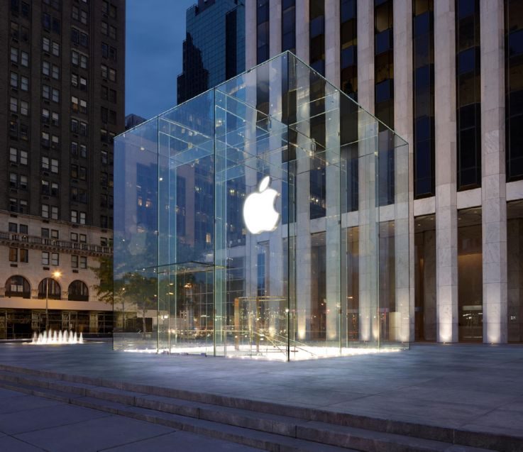
Open all day, every day of the year, Apple’s New York flagship is the store that never sleeps. It’s not your typical store though – the main building is underground with the entrance marked by a stunning 30-foot square glass cube. It could be a piece of art aside from the Apple logo.
Inside there is a 45ft Genius Bar for troubleshooting, with the rest of the space given over to product display. Staff are on-hand to help with queries, while the store also runs a programme of events to help customers get the best out of their products.
2. H&M (Barcelona)
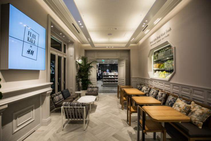
A new flagship opening is fashion company H&M’s giant Barcelona store, which is the brand’s first-ever space to have a food offering, courtesy of Flax & Kale. Inside there’s a mix of materials from marble to wood to glass, and a design that is sympathetic to the building itself, which add up to a more luxurious feel for the brand. With all of H&M’s clothing, kids, home and beauty ranges available under one roof, it’s the complete brand experience.
3. Primark (Madrid)
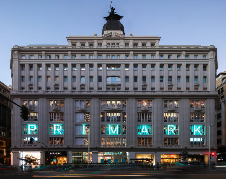
At 133,000 sq ft in size, clothing and homeware retailer Primark’s Madrid flagship almost feels like its own shopping centre. The design marries the historic details of the building with neon lighting and new technology, including 11 interconnected transparent screens in the atrium that create a 360 degree experience. Throughout the store there are striking design details, with each area having its own unique style and identity, which help customers lose themselves in the experience.
4. LEGO (London)
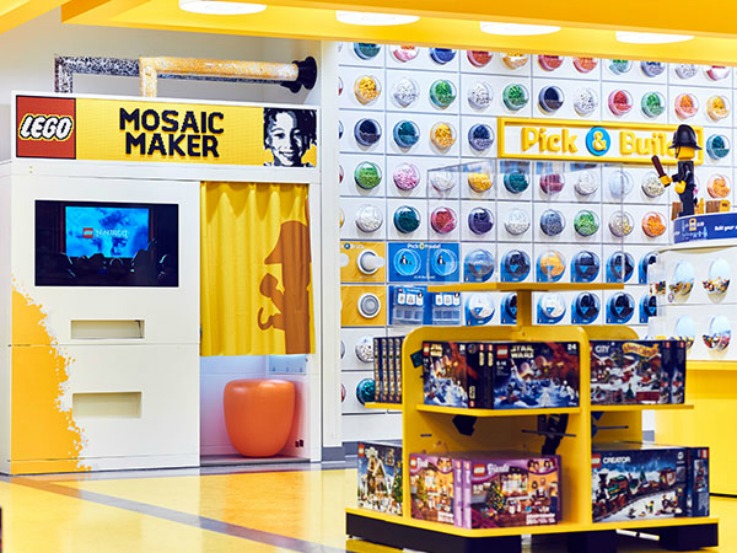
Another new opening is the biggest LEGO store in the world in London’s Leicester Square. The space is full of life-sized models, including a replica London Underground carriage that you can sit in, making it experiential and aspirational in terms of what is possible. It’s the perfect brand showcase, with customers even able to buy a personalised LEGO mosaic of their face. The digital endless aisle makes it easy for customers to view all of the sets available in the store, and staff can better serve shoppers by receiving requests for help to their smart watches.
5. Louis Vuitton (Singapore)
Louis Vuitton’s Island Maison in Singapore is a one-of-a-kind concept for the brand. The glass façade makes the store look more like a museum or art gallery or other cultural building, particularly given the position on the waterside. Inside the nautical theme extends to the design, and serves to underline the luxury nature of the brand, conjuring up the idea of private yachts. With lots to explore, and terrace spaces to relax on, it’s more of a lifestyle destination than shop.
6. Uniqlo (London)
Billed as a ‘global’ flagship store, fashion retailer Uniqlo reopened its London space last year, which boasts six floors, including a rooftop terrace for events. Two floors are given over to the new concept space Life WearHouse, which acts as a cultural hub with its own entrance from the street. It’s used to showcase Uniqlo’s LifeWear range with regularly changing themes, which gives shoppers a chance to interact with new products and ideas early on.
7. Samsung 837 (New York)
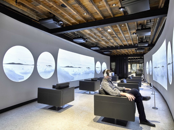
The ultimate experience space, to the extent that nothing is for sale, Samsung 837 is dominated by a huge screen that spans all three storey’s, which together with theatre-style seating, enables it to be used for events and livestreaming. As a space focused on experience, Samsung 837 let’s shoppers find out about everything the brand has to offer from VR to smart home products. A focal point is the gallery space that showcases collaborative projects with artists, such as the ‘Social Galaxy’ that combined screens and mirrors to surround shoppers with images from their Instagram feeds.
8. Miu Miu (Tokyo)
Looking a little like an open box on its side, fashion brand Miu Miu’s striking Tokyo flagship is made of steel. Inside metal copper walls continue the look, while also reflecting the products on display. It’s a unique space that has a minimal amount of products on display, which encourages customers to interact with individual items, while every design detail has been carefully thought out, down to the hangers. For those that don’t know the brand it’s an enticing space, but those that do also want to spend time there.
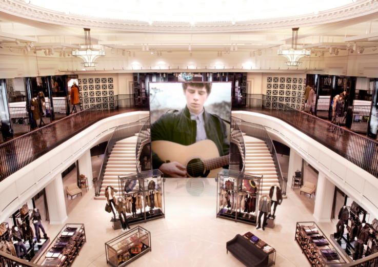
9. Burberry (London)
Out of all the Burberry stores, the Regent Street flagship is perhaps the greatest example of the blending of the brand’s digital and physical offerings. The store mirrors the different sections of the website to create a consistent experience, but is enhanced through the use of top tech like interactive mirrors. There’s also a focus on events with livestreaming and in-store experiences, which makes for more than your average shopping trip.
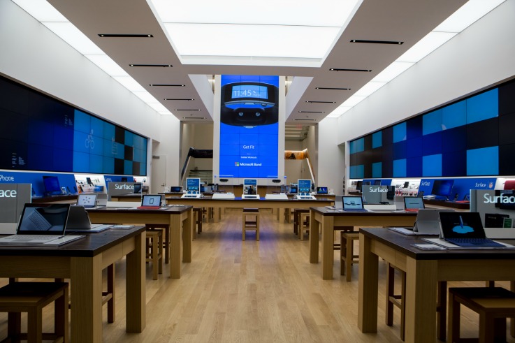
10. Microsoft (New York)
For its first flagship retail store, Microsoft opted for the wow factor with a glass façade that allows passerbys to see inside, and five floors of different offerings. A two-storey digital ‘culture wall’ oversees Microsoft’s various product ranges, while Dell has its own floor space. There’s also a community theatre for training workshops for staff, and other events. The store is also home to offices for Microsoft itself which keeps employees as close to the customer as possible.
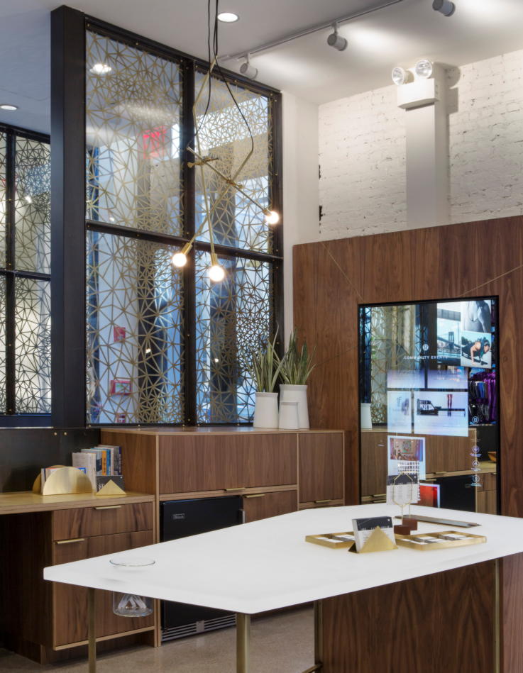
11. Lululemon (New York)
Located in the Flatiron district, atheleticwear brand Lululemon’s New York flagship is its largest to date at 11,500 sq ft. It’s specifically designed to bring in customers, and keep them there, by offering more than just clothing. The Concierge is a hangout space within the store that looks like a trendy kitchen and boasts a community board to discover new places to go and eat, as well as the ability to find and book local classes. In keeping with Lululemon’s community ethos, the top floor is home to Hub Seventeen, a space where nothing is for sale, but hosts classes, events, dinners and more.
12. Topshop (London)
At the heart of Oxford Circus is the iconic Topshop and Topman flagship store. Three different floors have everything you need to spend a day out, including a café, hairdressers, nail bar, barbers, and various pop-up services. Particularly successful is the extension of the personal shopping service to include men, with a specific lounge style space for customers to chill out in. While Topshop may be known throughout the UK, the flagship store lives up to its role of figurehead for the brand.
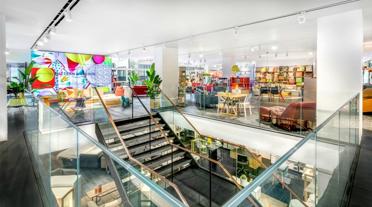
13. Habitat (London)
Homeware specialist Habitat reopened its newly revamped London flagship last year which puts the focus on experience. From the outside, the windows look onto room sets within the store giving it an open feel, while the dark floors let all of the design flair and colour used throughout the space pop. It’s an aspirational space, which also has interactive touchscreens throughout to link up the experience with Habitat’s website.
14. Tiffany & Co (New York)
Luxury jeweller Tiffany & Co’s flagship store on 5th Avenue is known throughout the world. The iconic store is a beacon for tourists and shoppers alike having been in the same spot for more than 75 years. As well as selling jewellery, the store tells the brand story, which includes being the home of the famous yellow Tiffany Diamond. Those who want the next level of service can book an appointment in the Tiffany salon to discuss custom designs.
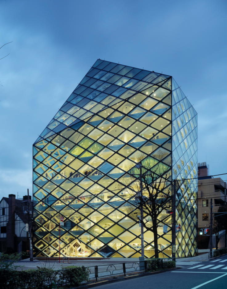
15. Prada (Tokyo)
Prada’s Tokyo Epicenter store, Japan’s largest flagship store at the time of opening, is another store making the most of glass for impact. The diagonal grid design makes it possible to see inside the entire store, which is enticing for visitors, but it also acts to make the walls feel thin, as though there is no barrier to entry. Inside there are six floors of Prada products from menswear to womenswear to fragrances meaning brand enthusiasts and new visitors can find anything they desire.
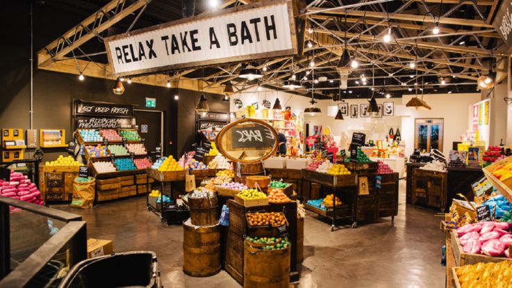
16. Lush (London)
It’s the biggest Lush store worldwide with three whole floors dedicated to exploration and experimentation. Customers can visit the ground-floor spa, try out the brand’s ethical bath and beauty products, and even test hair care products in the Hair Lab. As with all Lush stores, staff are hugely knowledgeable about what’s on offer and the ingredients in each product, so they can provide customers with advice and recommendations. The store is also home to exclusive products which adds to its draw as the place for Lush fans to visit.
17. Gucci (Shanghai)
You can’t mistake Gucci’s Shanghai flagship store as being anything else. The gold façade with Gucci branding dominates the surrounding area, with the gold theme carried over to the interior design. Despite being one of 28 Gucci stores in China at the time of opening, the store still manages to have the wow factor, with wood and marble adding to the luxurious feel. With a full range of Gucci fashion and accessories available, it’s a brand showcase first, shopping space second.
18. Charlotte Tilbury (London)
As the first standalone Charlotte Tilbury store, the design of the brand’s Coven Garden flagship is suitably glamorous with its art deco and old school Hollywood vibe. It offers two different shopping experiences to customers – Fast and Fabulous. Fast is for those in a hurry with the products needed to create 10 of the brand’s top looks laid out together, alongside visual and digital examples of how to recreate. Downstairs is the Fabulous concept aimed at those who want more of an experience, including having their make-up done at one of seven vanity tables that are inspired by icons like Marilyn Monroe.
19. Sephora (Shanghai)
More than 7,000 products are housed in this five-storey flagship from cosmetics chain Sephora. Even ‘Spehora University’ training centre. Design-wise there’s a visually impressive black-and-white striped theme that runs through the inside and outside of the store, with a number of different interactive nail and make-up areas for customers to explore. The best of these is the perfume selection counter, which has a selection of suggested perfumes for different occasions. Each perfume has a corresponding flower-like horn which customers can use to see what they smell like. For extra guidance, they can complete a quick quiz on an iPad which will tell them which perfume they might like best.
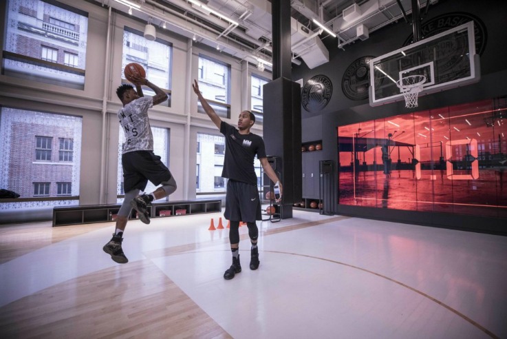
20. Nike (New York)
New York’s Soho district has recently gained a new 50,000 sq ft, five floor, Nike flagship store. It’s the ultimate example of immersive shopping with customers able to try out Nike products on treadmills, basketball court and playing football. Cameras track their movements and record them on the Nike+ app where they can be analysed, and help with decision-making. Staff can also see when customers last tried out the experiences and what products they were using, which improves product suggestions. While the design offers the wow factor, it’s the experiential elements that elevate this over other Nike stores.

21. Mac (Paris)
Another amazing beauty flagship is Mac Cosmetics’ Paris store. Located on the famous Champs-Élysées, the store feels almost futuristic thanks to the curved interior design and use of mirrors and black tiles. Big and bright graphics give it a young and edgy feel, with products spread out over two floors to give customers as much of the brand’s range as possible. Being a flagship store is also has more experiential elements including a VIP area for special events, presentations and VIP appointments.
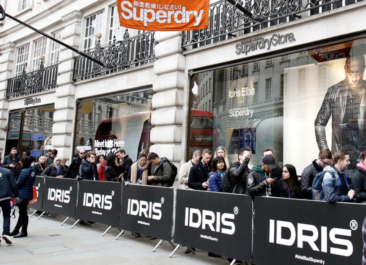
22. Superdry (London)
Located on London’s Regent Street, this four-floor Superdry flagship uses dark and light throughout its design for dramatic effect. The store uses a lot of dark wood for its displays, walls and floors, with metal, glass and exposed brick adding an industrial vibe to the space. There’s a lot of lights at work, but they’re focused on stock and mannequins, which gives the space as a whole a closer feel. Down in the basement is the Premium Lounge, which retains the original art-deco design of the building and is used for personal shopping and styling. Separating it in this way gives it a more exclusive feel, with the space also used to show off latest collections and exclusive collaborations.
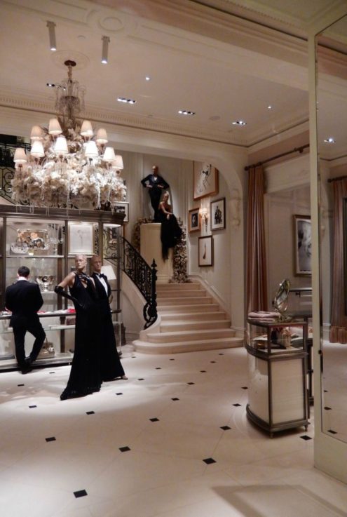
23. Ralph Lauren (New York)
There’s a few to pick from, but we think Ralph Lauren’s mansions, which sees men and womenswear sitting across the road from each other in their own luxurious mansions, pip the others for top flagship. Each has its own elegant design, which is sympathetic to the original architecture, which makes the spaces feel more like luxurious homes than normal stores, and are perfectly tailored to their target audiences, right down to the services offered. As a flagship concept, the mansions are a perfect figurehead for the Ralph Lauren brand.
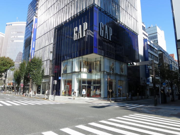
24. Gap (Tokyo)
With it clear and blue glass design, which cleverly mimics the Gap logo, the clothing brand’s Tokyo flagship is impressive before you even go inside. Four floors mean that all elements of Gap’s offering can be found inside, from menswear to womenswear and children’s, with the first floor dedicated to new and special seasonal products. The colour theme continues inside, cleverly using bright blue fluorescents to highlight signage and products to great effect against the store’s white background. Plus the bright blue lit-up elevators are a stunning focal point.
25. MUJI (Tokyo)
Located in Tokyo’s Yurakucho, this is MUJI’s largest store worldwide. It may not look like it from the outside, the store has three floors and every single product MUJI offers available to buy. In keeping with the brand ethos, the design is fairly simple, but effective – all wood and glass. Although there’s some quirky display ideas throughout, the wow factor comes from the two-storey sheet metal MUJI house, which sits inside the store and let’s customer explore the company’s offerings in room sets. There’s also an in-store café, which helps to keep customers in the space for longer.
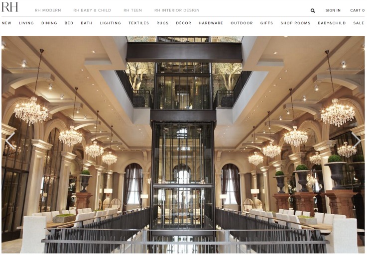
26. Restoration Hardware (Boston)
Home furnishings company Restoration Hardware has turned a former museum in Boston into an iconic flagship space. Chandeliers, pillars, huge windows and a central glass elevator allude to the building’s previous use, but also make Restoration Hardware’s homewares and room sets look as high-end as possible. You can almost imagine the store as some luxurious living space. The third floor has a huge Eiffel Tower replica, as well as an in-store wine bar and olive trees, plus a cinema room showing old films on TV screens.
27. Puma House (Tokyo)
Looking more like an art exhibition than our obvious store, Puma House in Tokyo is a great example of a flagship store doing something different, but showcasing what the brand has to offer. The whole is quite stark with plenty of exposed concrete and white paint. Wrapping around all of this is dark wooden stairs on which the different shoes are displayed – there’s no traditional shelves or units anywhere. The space also has a press and events space for product launches, exhibitions, events and more.
28. Dior (London)
As you might expect from Dior, The House of Dior on New Bond Street is a super luxurious space. The focus is on customer experience, rather than technology, which is why the store is full of sofas for shoppers to sit on, beautiful artwork and sculptures and VIP shopping areas. It’s all about having space to engage with the brand and its products. With grey as the main colour, which means all of the products pop against it, the space is more akin to walking around a beautifully designed house than a store.
29. Victoria’s Secret (New York)
The world’s largest Victoria’s Secret in New York defines many of the design elements seen in the brand’s other flagships and stores. The black walls and pink display details, marble floors and chandeliers add up to a glamorous and luxurious shopping space that perfectly ties in with the brand and its products. With different areas and rooms on each floor, rather than one open shopping space, the store feels more intimate and experiential.
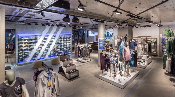
30. Adidas Originals (Berlin)
Also going for the industrial feel, but a very different atmosphere is the Adidas Originals flagship in Berlin, the first of these Adidas Original stores. Grey and blue are the highlight colours here, from the shop exterior to the inside displays. There’s a lot of metal and concrete at work, but the bright lighting (apparently inspired by Berlin itself), especially the blue neon used on the shoe displays, gives it a cool vibe. The space is designed to fit into the local neighbourhood and runs a series of events and product launches to connect with customers. Plus, in-store stations for customising products add an element of personalisation.
31. Longchamp (Paris)
Last year luxury leather goods brand Longchamp revamped its rue Saint-Honoré flagship in Paris. While the works went on the store chose to cover them with a façade of beautiful bright coloured artwork by artist Ryan McGinness, which kept all eyes on the space. Although the now reopened store doesn’t have that same eye-catching colourful look, it’s still a fabulous example of the best-of-the-best flagship experience. There are a lot of natural textures within the space, as well as light, which combined with the layout creates a lot of space for customers to move through and explore the products on offer.
32. Disney (Shanghai)
It’s the first Disney store in China and the biggest of its type in the world. From the air you can see the iconic Mickey Mouse shape, which at night is lit up by LEDs, while inside the focus is all on fun and experience for kids and their families. There’s a 19 foot high replica of Disney’s Magic Kingdom castle which hosts a musical and projection show, a talking Magic Mirror, huge Marvel models and other magical elements aimed at selling the Disney ethos to customers.
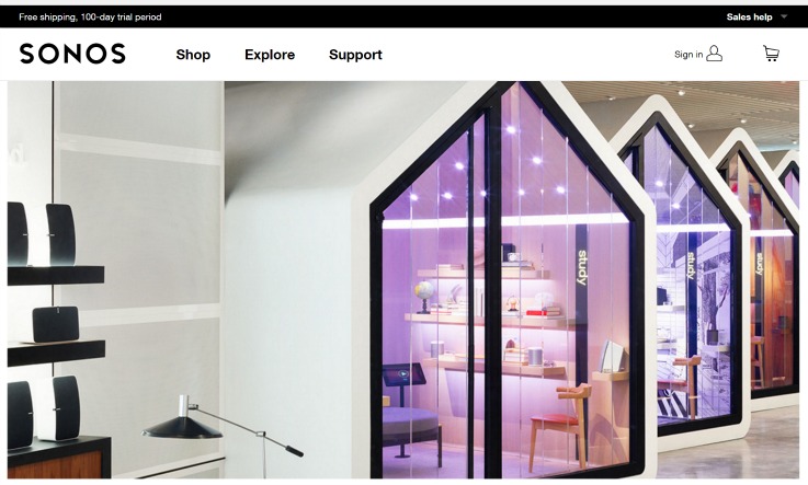
33. Sonos (New York)
For wireless speaker brand Sonos it’s all about experience translating into sales and the New York flagship reflects that. The focus is on seven sound-proof pods that are shaped like houses, and each have their own design, where customers can test out the different speaker types. Lounge areas are spread out throughout the store to encourage people to chill and chat, while the ‘Wall of Sound’ feature wall of Sonos products shows the extent of what is on offer. It’s a much more exciting space than your average electronics store, which helps bring new customers to the brand.
34. Dr Martens (New York)
Dr Martens New York flagship shows how you can still create that brand experience in a smaller store. There’s a British vibe to the décor with its leather seating for shoppers and coffee table style product displays. The store also uses Dr Martens’ iconic boots as part of the design aesthetic as well with large glass-fronted cases of different products and memorabilia set into the walls like mirrors. As a dedicated local space for customers to get closer to the brand it’s a great concept.
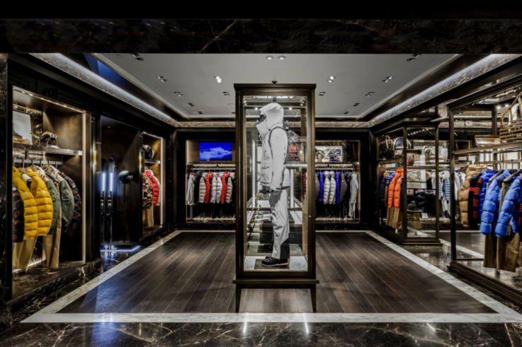
35. Moncler (New York)
The Moncler Madison Avenue flagship celebrates both its location and the brand’s well-known jackets. Home to the most extensive array of Moncler products in North America, the launch of the store was marked by a short musical film by Spike Lee and a special American flag display made up of 28 one-off jackets designed by Thom Browne. The store balances light and dark marble with specially-designed pieces of artwork, including a kinetic light sculpture from Belgian artist Bardula.
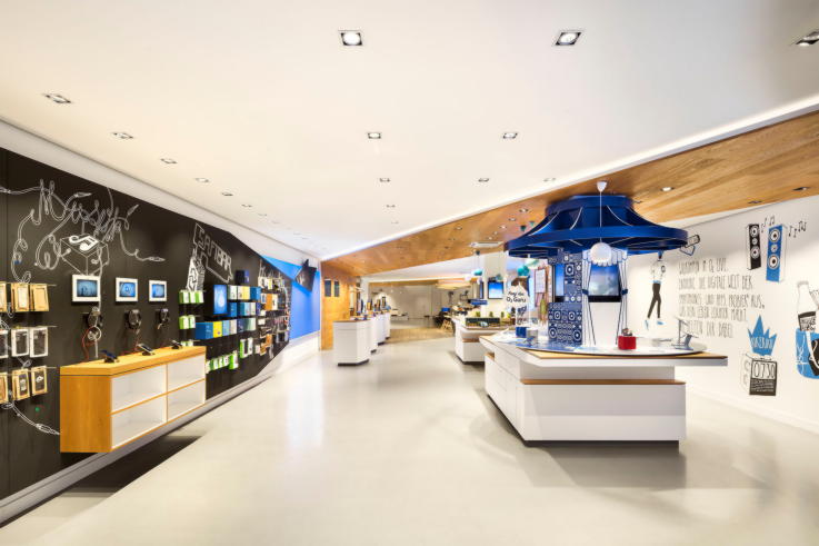
36. O2 (Berlin)
O2’s Berlin flagship is a great space because it doesn’t look like your typical phone shop. The design is light and bright, using wood and chalkboard effects to create an inviting space. While there are some products and accessories on display, it’s more about encouraging shoppers to spend time in the place. This means there’s lots of cool and comfy places for people to just sit and hang-out, as well as a coffee shop and lockers for customers to charge their phones.
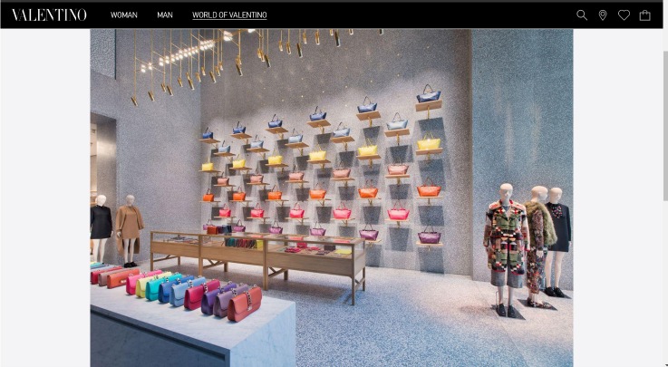
37. Valentino (New York)
Although fashion brand Valentino’s New York flagship has just three floors, the exterior glass façade actually covers eight storeys making it a stunning reflection of Fifth Avenue. The main interior design feature is grey Terrazzo against which Valentino uses brass, wood and marble to display its products. With menswear, womenswear and accessories all on offer, it’s the grand scale of the space that elevates this flagship.
38. Kirk Originals (London)
For innovative design look no further than British eyewear brand Kirk Originals’ London flagship store. It captivates even from the outside as cut-outs of eyes hang in the windows and customers can see inside the dark-painted space. Inside though, the wow factor is ramped up by an art-like display of glasses on faces popping out from the walls, which lead customers through to a kaleidoscope projection of the brand’s logo.
39. UGG (Sydney)
UGG’s flagship Sydney store is actually its second in the city, as well as its largest in Australia. While UGG is well known for its boots, the two-floor store is also home to its clothing, accessories and homewares ranges. The design reflects the classic UGG colours of brown and cream, with comfortable sofas and seating throughout the space for weary shoppers. It’s a beautiful, warm space that invites you in – useful in introducing those who might only be familiar with one part of UGG to the rest of the offering.
40. Zara (Rome)
The building design of fashion brand Zara’s flagship store in Rome is incredible in its own right, but inside the space takes your breath away. There are five square-shaped floors, all centered around a middle opening which is strung with lighting, which makes the space feel more impressive. The design feels faithful to the exterior as well with its use of marble and columns, while the use of greenery and trees on each floor adds a little something extra. As a flagship it feels a long way from Zara’s high street stores, perhaps showing a different side to the brand.
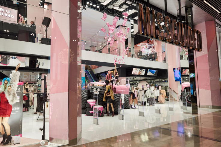
41. Missguided (London)
Missguided’s first-ever physical store is a brilliant flag-bearer for the brand. The design perfectly encapsulates the brand ethos, from the bright pink truck and motorcycle set pieces to the hang-out style fitting rooms and numerous selfie opportunities. The store has been designed with textures and materials that can be quickly changed out to later the look and feel as new ranges come in. It also links into the brand’s website to showcase the same content and products as online for a more cohesive experience.
42. Hermes (Singapore)
Last year Hermes reopened its Singapore flagship at Liat Towers after 15-months of renovation. The revamped space now has a stunning blue façade with window space for artist exhibitions. Inside the top floor is also a dedicated art exhibition space. The rest of the store has everything from the usual clothing and accessories to writing and stationery products and the brand’s equestrian range, allowing shoppers to immerse themselves in the Hermes lifestyle.
43. Bulgari (Rome)
Another store that has been revamped in recent years is luxury goods brand Bulgari’s Rome flagship. The work was aimed at enhancing the already beautiful building and its history, including adding back in the VIP door used by stars in the past and sliding doors to the room Elizabeth Taylor spent time in. The space feels suitably luxurious with its marble and dark wood features, and the gallery-style layout of individual rooms makes it easy to move about and see everything.
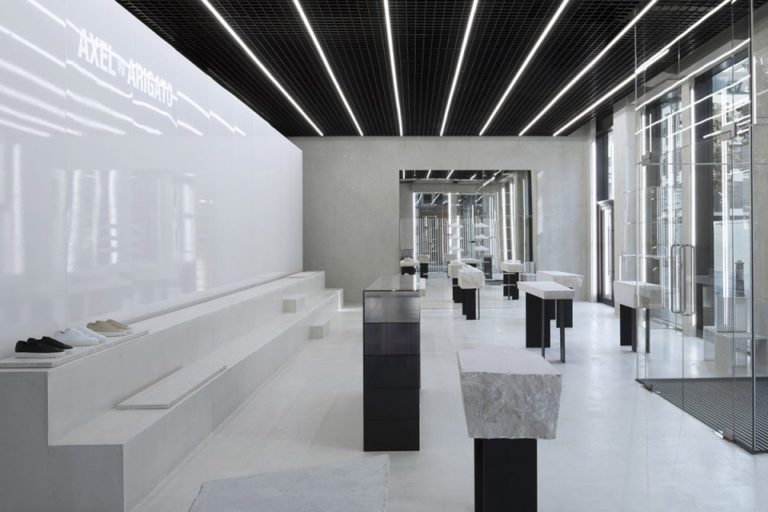
44. Axel Arigato (London)
Designer trainer brand Axel Arigato’s first London flagship is a minimal design statement. All black, white and grey in design, even looking in from the outside you can’t see a lot, which may well intrigue those unfamiliar with brand. Products are displayed on simple concrete tables or wall screen-like dividers, which conjures up feelings of an art gallery. With nothing to distract customers though it means all of the focus is on the shoes.
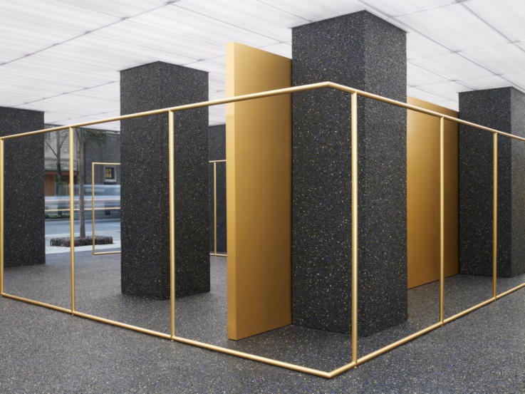
45. Acne Studios (New York)
Minimal in terms of products on sale, but maximum when it comes to impactful design, Acne Studios’ New York flagship is another space pushing the boundaries of what we expect stores to look like. With just a small, curated array of items on them it’s the gold metal of the shelves, hangers and walls themselves that do the talking. They’re offset by black asphalt floors and pillars, flecked with semi-precious stones, which makes it feel like a special and luxurious space.
46. Charlotte Olympia (London)
As the first UK flagship for footwear brand Charlotte Olympia, the Maddox Street store has similar hallmarks to many of the brand’s other spaces. From the outside the store looks quite understated, aside from the leopard statue with a shoe in its mouth in the window, but inside gold dominates. Shoes are displayed like art pieces or jewellery, each on their own stand and lit from above with spotlights, and the space has plenty of spaces for customers to sit down and talk to staff about their purchases.
47. Guerlain (Paris)
Guerlain’s store at 68 Champs-Elysées is an iconic flagship space. Gold and glass dominate the design with the brand’s fragrance line displayed on all sort of uniquely shaped units and holders. The space is geared up for interaction and exploration, with room also given over to Guerlain’s make-up and skincare ranges. Customers can also go deeper into the Guerlain world through the in-store restaurant and spa facilities.
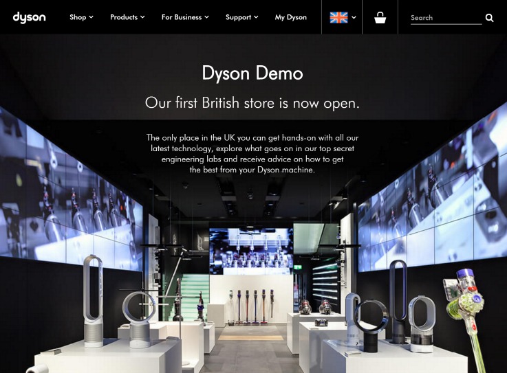
48. Dyson (London)
Dyson’s store in London is yet another first-ever physical space for a brand in Britain. Created to let customers play with and experience Dyson products, the space showcases just one of each item on a plinth, with no other stock on display. Customers can test out the products, particularly vacuum cleaners on different types of floor, and even dirt. There is also an in-store hair salon where customers can have their hair blow-dried with Dyson’s new hairdryer.
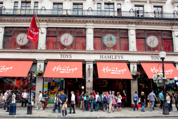
49. Hamley’s (London)
A tourist attraction in its own right, Hamley’s seven-floor Regent Street flagship is the biggest and oldest toy shop in the world. As such, it’s a mecca for toy fans, kids and adults alike. Like the products it sells, the store design is all about play and fun, from the big red London bus that houses the stairs/escalators to the staff demonstrating products on the shop floor. When it comes to living and breathing a brand, Hamley’s is a genuine experience.
50. Opening Ceremony (Tokyo)
Replacing the original Opening Ceremony flagship in Tokyo, the fashion company’s Omotesando store covers four floors, each with their own theme. Bright colours and quirky graphic patterns add interest throughout, as do the display cases set in life-sized animal models. It’s an inspiring space that encourages people to take photos and share their experience, which in turn draws others in.
Liked this post? Refresh the basics with our guide to what is a flagship store, or indulge in more beautiful store design with our list of the top 50 concept stores worldwide.
Or if you’re looking for a retail consultancy with experience in game-changing store designs, talk to us today.

